2016-04-05 95 views
4

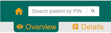
我目前正在为使用Bootstrap的网站设计一个导航栏。有一个主导航栏和第一直属的第二个,看图片:带自定义边角的html按钮

enter image description here
我总算圆按钮底​​部的四角采用简单的CSS但上角我想达成的目标是这样的:

enter image description here
是否有办法在CSS/jQuery的或额外的插件来做到这一点?

编辑:

HTML的按钮是:

<button type="submit" class="btn navbar-btn second-navbar-button"> 
    <span class="mdi mdi-eye second-navbar-icon"></span> 
    <span class="second-navbar-name">&nbsp;Overview</span> 
</button> 

该按钮的CSS如下所示

.second-navbar-button { 
    font-size: 26px; 
    border: none; 
    background-color: transparent; 
    color: #ec9f14; 
    margin: 0 19px 0 19px; 
    padding: 0px 8px 0px 8px; 
    border-top-left-radius: 0px; 
    border-top-right-radius: 0px; 
    border-bottom-left-radius: 10px; 
    border-bottom-right-radius: 10px;} 

有按键之间的空间,以便操纵的角落相邻的按钮将不起作用,afaik。

干杯,

Trammy

+0

我可能是错的,但如果你仔细看,左边和右边的圆边(顶部)实际上可能来自相邻按钮上的圆角边缘。 –

+3

你可以使用'before'和'after'伪元素来实现这一点,放一些代码,这样我可以帮助你更多 –

+0

谢谢Anas,我现在已经为按钮添加了CSS代码。希望有所帮助。 – ftramnitzke

回答

1

见这个例子:

.button{ 
 
    border:1px solid red; 
 
    border-bottom:0; 
 
    width:80px; 
 
    height:40px; 
 
    margin:30px; 
 
    position:relative; 
 
    -moz-border-radius:5px 5px 0 0; 
 
    -webkit-border-radius:5px 5px 0 0; 
 
} 
 
.button:after, 
 
.button:before{ 
 
    content:''; 
 
    width:40px; 
 
    height:30px; 
 
    border:1px solid red; 
 
    position:absolute; 
 
    bottom:-3px; 
 
    border-top:0; 
 
} 
 
.button:after{ 
 
    border-left:0; 
 
    -moz-border-radius:0 0 5px 0; 
 
    -webkit-border-radius:0 0 5px 0; 
 
    left:-41px; 
 
} 
 
.button:before{ 
 
    border-right:0; 
 
    -moz-border-radius:0 0 0 5px; 
 
    -webkit-border-radius:0 0 0 5px; 
 
    right:-41px; 
 
}
<div class="button">text</div>

+0

谢谢佩德拉姆。这对我有很大的帮助,并指出了我的正确方向。 – ftramnitzke