2016-10-11 54 views
7

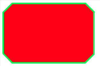
我需要为此“形状”添加边框。这很难,因为和之前的伪元素的形状是由制成的。我找不到正确的方法。为此“形状”添加边框

我需要实现:

enter image description here

的代码,我到目前为止有:

https://jsfiddle.net/jimmyadaro/xfcjfz3d/

#octagon { 
    width: 300px; 
    height: 200px; 
    background: red; 
    position: relative; 
    -webkit-box-sizing: content-box; 
    -moz-box-sizing: content-box; 
    box-sizing: content-box; 
    display: block; 
} 

#octagon:before, 
#octagon:after { 
    content: ""; 
    position: absolute; 
    left: 0; 
    right: 0; 
} 

#octagon:before { 
    top: 0; 
    border-bottom: 30px solid red; 
    border-left: 30px solid #fff; 
    border-right: 30px solid #fff; 
} 

#octagon:after { 
    bottom: 0; 
    border-top: 30px solid red; 
    border-left: 30px solid #fff; 
    border-right: 30px solid #fff; 
} 

<div id="octagon"></div> 

我试着用阴影和没有成功的轮廓。

感谢您的阅读。

注:如果有问题,我将使用纯色背景色。

+2

此链接可以帮助你http://stackoverflow.com/questions/34641588/how-do-i-give-a-css-octagon-shape-一个全国性的 – Geeky

+0

谢谢@geeky,我已经看到,但看起来不可扩展。我的意思是,它不能是600x200px。至少在我尝试过的方式中。 –

+0

相关 - http://stackoverflow.com/questions/34644437/how-do-i-add-a-border-to-an-8-point-star-css-shape但SVG在这里是最优的。 –

回答

2

好了,这是我能想到的纯CSS接近它的唯一途径:

的jsfiddle这里:https://jsfiddle.net/xfcjfz3d/7/

body { 
 
    background:#fff; 
 
} 


#octagon { 
 
    position:relative; 
 
\t width: 300px; 
 
\t height: 200px; 
 
\t background: green; 
 
\t position: relative; 
 
\t -webkit-box-sizing: content-box; 
 
\t -moz-box-sizing: content-box; 
 
\t box-sizing: content-box; 
 
\t display: block; 
 
} 


#octagon:before, 
 
#octagon:after { 
 
\t content: ""; 
 
\t position: absolute; 
 
\t left: 0; 
 
\t right: 0; 
 
} 


#octagon:before { 
 
\t top: 0; 
 
\t border-bottom: 30px solid green; 
 
\t border-left: 30px solid #fff; 
 
\t border-right: 30px solid #fff; 
 
} 


#octagon:after { 
 
\t bottom: 0; 
 
\t border-top: 30px solid green; 
 
\t border-left: 30px solid #fff; 
 
\t border-right: 30px solid #fff; 
 
} 


.tall { 
 
    position:absolute; 
 
    background:red; 
 
    width:230px; 
 
    height:190px; 
 
    left:35px; 
 
    top:5px; 
 
    z-index:1; 
 
} 


.wide { 
 
    position:absolute; 
 
    background:red; 
 
    width:290px; 
 
    height:130px; 
 
    left:5px; 
 
    top:35px; 
 
    z-index:1; 
 
} 


.corner { 
 
    position:absolute; 
 
    background:red; 
 
    width:45px; 
 
    height:43px; 


    z-index:1; 
 
    transform: rotate(45deg); 
 
} 


.topleft { 
 
    left:14px; 
 
    top:14px; 
 
} 


.topright { 
 
    //background:black; 
 
    left:241px; 
 
    top:13px; 
 
} 


.bottomleft { 
 
    background:red; 
 
    left:13px; 
 
    top:143px; 
 
} 


.bottomright { 
 
    background:red; 
 
    left:241px; 
 
    top:143px; 
 
}
<div id="octagon"> 
 
    <div class="tall"></div> 
 
    <div class="wide"></div> 
 
    <div class="corner topleft"></div> 
 
    <div class="corner topright"></div> 
 
    <div class="corner bottomleft"></div> 
 
    <div class="corner bottomright"></div> 
 
</div>

+0

谢谢,@varin好的方法,但似乎不可扩展。另外,我需要在形状(文本,图像等)内添加元素。无论如何,非常感谢。 –

+0

嗯。我认为这可以通过使用不同的单位进行扩展。如果你需要内部元素,你可以随时在内容和更高的z-index中添加另一个div。 – Varin

6

这里是我的解决方案。没有固定的背景颜色是必需的。这可能会或可能不适合您的实际使用情况。

JSFiddle

#octagon { 
 
    display: flex; 
 
    justify-content: center; 
 
    align-items: center; 


    width: 300px; 
 
    height: 200px; 
 
    overflow: hidden; 
 
    position: relative; 
 
} 


#octagon:before, 
 
#octagon:after { 
 
    content: ""; 
 
    display: block; 
 
    width: 300px; 
 
    padding-top: 100%; 
 
    position: absolute; 
 
    top: 50%; 
 
    left: 50%; 
 
    transform: translate(-50%, -50%) rotate(45deg); 
 
    z-index: -1; 
 
} 
 
#octagon:before { 
 
    background: red; 
 
} 
 
#octagon:after { 
 
    background: 
 
     linear-gradient(
 
    \t \t 45deg, 
 
\t  \t #0e0 calc(50% - 150px + 10px), transparent 0, 
 
    \t \t transparent calc(50% + 150px - 10px), #0e0 0%), 
 
    \t linear-gradient(
 
    \t \t -45deg, 
 
    \t \t #0e0 calc(50% - 100px + 10px), transparent 0, 
 
    \t \t transparent calc(50% + 100px - 10px), #0e0 0); 
 
    box-shadow: 0 0 0 10px #0e0 inset; 
 
}
<div id="octagon">Hello World!</div>

+0

哇@darrylyeo感谢您的奉献!对此,我真的非常感激!如果我需要更薄的边框(如2像素),我该如何改变它? –

+0

很高兴帮助,我喜欢挑战!查看最后一个规则集“#octagon:after”。对角线由'box-shadow'控制,其余边由'线性梯度'中的百分比控制。我有点着眼它,但我相信有一个更加数学的方法来计算这些值('calc()'会派上用场)。 – darrylyeo

+0

明白了!你现在只需要替换'10px'的所有实例。 – darrylyeo