0
我有一个容器(包装)与两行容器,我给两行的高度值作为自动,以便它可以根据它的内容动态调整大小(而不是给出每行的具体高度,例如行顶高度46%和行底高度54%)。我试图让底部行容器的高度自动用CSS填充屏幕(*不用JavaScript)。请检查下面的图像以获得预期的结果。请指教,谢谢。集装箱行高自动填充/用CSS调整
Click here for preview at JSfiddle
HTML
<div id="content-wrapper">
    <div id="row-top">
     Lorem Ipsum is simply dummy text of the printing and typesetting industry.Lorem Ipsum is simply dummy text of the printing and typesetting industry.Lorem Ipsum is simply dummy text of the printing and typesetting industry.Lorem Ipsum is simply dummy text of the printing and typesetting industry.
    </div>
    <div id="row-bottom">
     <iframe id="gmap"></iframe>
    </div>
</div>
CSS
#content-wrapper {
    display:block;
    height:100%;
    overflow-y: scroll;
    width:600px;
    float:left;
    background-color:yellow;
}

#row-top {
    color:#fff;
    display:block;
    position:relative;
    width:100%;
    height:auto;
    background-color:blue;
}

#row-bottom {
    display:block;
    width:100%;
    height:auto;
}

iframe#gmap {
    overflow: hidden;
    height:100%;
    width: 100%
}
Click here for preview at JSfiddle
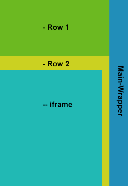
预期的结果:
THX为你的建议(在Chrome和Firefox的唯一测试),真的很感谢。然而,这仍然不是我想要实现的,因为那需要为两行的容器设置一个特定的高度,以便获得该作品加上它(绿色行)不会填充剩余的空隙屏幕底部。附:测试过firefox 25和chrome 31 – wei
您也可以将'height'设置为'100%',就像您的代码一样。那不是你想要的吗?这里的结果是:http://jsfiddle.net/Q4uC8/2/ –
是的,你是对的。我刚刚意识到,它不起作用的原因,因为你没有提到,因为HTML,身体没有设置为高度:100%在jsfiddle。非常感谢。不幸的是,这不会在低于10的IE浏览器上工作,因为我认为我可以找到一种方法来实现像列一样的实现。 – wei