0
我有如下表(jsFiddle):响应表的垂直和水平头
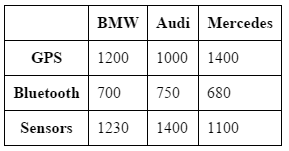
<table>
    <tr>
     <th></th>
     <th scope="col">BMW</th>
     <th scope="col">Audi</th>
     <th scope="col">Mercedes</th>
    </tr>
    <tr>
     <th scope="row">GPS</th>
     <td>1200</td>
     <td>1000</td>
     <td>1400</td>
    </tr>
    <tr>
     <th scope="row">Bluetooth</th>
     <td>700</td>
     <td>750</td>
     <td>680</td>
    </tr>
    <tr>
     <th scope="row">Sensors</th>
     <td>1230</td>
     <td>1400</td>
     <td>1100</td>
    </tr>
</table>
我如何使它响应,从而使移动设备上的表如下所示:

<table>
    <tr>
     <th></th>
     <th scope="col">BMW</th>
    </tr>
    <tr>
     <th scope="row">GPS</th>
     <td>1200</td>
    </tr>
    <tr>
     <th scope="row">Bluetooth</th>
     <td>700</td>
    </tr>
    <tr>
     <th scope="row">Sensors</th>
     <td>1230</td>
    </tr>
</table>
是否有可能只在CSS中做到这一点?我猜不是因为我将需要复制垂直的标题
我尝试了相反的方法:从移动布局开始,我获得了桌面布局:http://codepen.io/anon/pen/qEwodb - 如果可以接受,我可以将它添加为答案 – fcalderan 2015-04-02 10:49:01
看来您正在寻找一个CSS解决方案*重复*表,而不是响应。 – 2015-04-02 10:51:19
@FabrizioCalderan谢谢。这是一个有趣的方法。做它作为答案。 – Cornwell 2015-04-02 11:00:02