2014-07-12 124 views
10

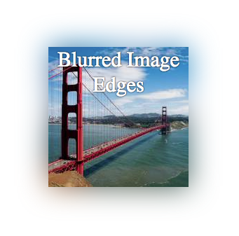
我知道有一堆新的CSS过滤器,我想知道是否有将这些应用于图像或背景图像的方法。我读过的所有内容都是关于使用阴影柔化图像的说法,但是,阴影是一种颜色,我想模糊图像的边缘,以便我们可以更加无缝地融合在一起,如果它们彼此相邻。现在看起来您只能使用阴影或对整个图像应用模糊(基于我已阅读的内容)。使用CSS模糊图像或背景图像的边缘

我可以想出最接近的是一个半透明的盒子阴影....这样

-webkit-box-shadow: 12px 29px 81px 0px rgba(0,0,0,0.75); 
-moz-box-shadow: 12px 29px 81px 0px rgba(0,0,0,0.75); 
box-shadow: 12px 29px 81px 0px rgba(0,0,0,0.75); 
+0

给一个你想要的链接。 并开发一个与你的形象小提琴。我们可以帮助你实现你的要求。 –

回答

9

我不完全知道什么视觉效果导致你后,但这里是一个简单的模糊图像边缘的方法:将图像放在另一个div内,并将图像与模糊图像放在一起。

工作示例这里: http://jsfiddle.net/ZY5hn/1/

Screenshot

HTML:

<div class="placeholder"> 
    <!-- blurred background image for blurred edge --> 
    <div class="bg-image-blur"></div> 
    <!-- same image, no blur --> 
    <div class="bg-image"></div> 
    <!-- content --> 
    <div class="content">Blurred Image Edges</div> 
</div> 

CSS:

.placeholder { 
    margin-right: auto; 
    margin-left:auto; 
    margin-top: 20px; 
    width: 200px; 
    height: 200px; 
    position: relative; 
    /* this is the only relevant part for the example */ 
} 
/* both DIVs have the same image */ 
.bg-image-blur, .bg-image { 
    background-image: url('http://lorempixel.com/200/200/city/9'); 
    position:absolute; 
    top:0; 
    left:0; 
    width: 100%; 
    height:100%; 
} 
/* blur the background, to make blurred edges that overflow the unblurred image that is on top */ 
.bg-image-blur { 
    -webkit-filter: blur(20px); 
    -moz-filter: blur(20px); 
    -o-filter: blur(20px); 
    -ms-filter: blur(20px); 
    filter: blur(20px); 
} 
/* I added this DIV in case you need to place content inside */ 
.content { 
    position: absolute; 
    top:0; 
    left:0; 
    width: 100%; 
    height: 100%; 
    color: #fff; 
    text-shadow: 0 0 3px #000; 
    text-align: center; 
    font-size: 30px; 
} 

通知模糊效果全光照g图像,因此它随图像颜色而变化。

我希望这会有所帮助。

+0

这太好了。我真的想通过一个解决方案去除图像的“硬”边缘(这样我就可以对付两个图像并平滑过渡),但我认为这是一个好的开始。 – Startec

+0

哦,那就容易了。我已经添加了关于如何实现该效果的另一个答案。如果您需要放置两个图像并在它们之间转换,只需选择过渡颜色并使用像我在第二个答案中解释的方块阴影。 – Leonardo

51

如果你正在寻找的只是模糊图像边缘,你可以简单地使用带阴影的插图。

工作例如: http://jsfiddle.net/d9Q5H/1/

Screenshot

HTML:

<div class="image-blurred-edge"></div> 

CSS

.image-blurred-edge { 
    background-image: url('http://lorempixel.com/200/200/city/9'); 
    width: 200px; 
    height: 200px; 
    /* you need to match the shadow color to your background or image border for the desired effect*/ 
    box-shadow: 0 0 8px 8px white inset; 
} 
+0

@Startec做了这项工作? – Leonardo

+0

这是有效的,如果你想要一个动态的宽度/高度,你也可以在div中添加style =“visibility; hidden;” –