1
A
回答
1
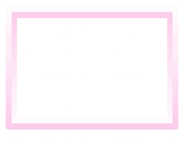
既然你想做纯CSS,这里有一个方法:
.dblgradbox {

\t margin: auto;

\t padding: 15px;

\t width: 275px;

\t height: 200px;

\t border: 15px solid transparent;

\t border-top: 10px solid transparent;

\t border-image: linear-gradient(to bottom, transparent, #FBCDEA) 3 100%;

\t box-shadow: 0 15px 0 0 #FBCDEA, 0 -5px 0 0 #F7FCFF, inset 0px 15px 0 0 #FBCDEA;

\t background-image: linear-gradient(#FBCDEA, transparent), linear-gradient(#FBCDEA, transparent);

\t background-size: 15px 100%;

\t background-position: 0 0, 100% 0;

\t background-repeat: no-repeat;

\t border-radius: 7px;

}
<div class="dblgradbox">
x3ns
</div>看看 “全页” 运行的代码段后。我没有包含任何跨浏览器的属性,因为这是一个例子。
此方法通常通过应用渐变边框,并使用盒阴影插入技术来帮助完成元素内的效果 - 因此也需要填充以适应内容。背景图像仅在插图的两侧显示两个渐变条。
0
也许是这样吗?
*{

    box-sizing: border-box;

}


.wrap{

    width: 300px;

    height: 300px;

    padding: 20px;

    margin: 25px auto;

    border-radius: 10px;

    background: rgb(254,249,253); /* Old browsers */

background: -moz-linear-gradient(top, rgb(254,249,253) 0%, rgb(253,230,246) 50%, rgb(253,204,234) 100%); /* FF3.6+ */

background: -webkit-gradient(linear, left top, left bottom, color-stop(0%,rgb(254,249,253)), color-stop(50%,rgb(253,230,246)), color-stop(100%,rgb(253,204,234))); /* Chrome,Safari4+ */

background: -webkit-linear-gradient(top, rgb(254,249,253) 0%,rgb(253,230,246) 50%,rgb(253,204,234) 100%); /* Chrome10+,Safari5.1+ */

background: -o-linear-gradient(top, rgb(254,249,253) 0%,rgb(253,230,246) 50%,rgb(253,204,234) 100%); /* Opera 11.10+ */

background: -ms-linear-gradient(top, rgb(254,249,253) 0%,rgb(253,230,246) 50%,rgb(253,204,234) 100%); /* IE10+ */

background: linear-gradient(to bottom, rgb(254,249,253) 0%,rgb(253,230,246) 50%,rgb(253,204,234) 100%); /* W3C */

filter: progid:DXImageTransform.Microsoft.gradient(startColorstr='#fef9fd', endColorstr='#fdccea',GradientType=0); /* IE6-9 */

}

.wrap div{

    width: 100%;

    height: 100%;

    padding: 20px;

}

.wrap .inner{

    background: rgb(253,204,234); /* Old browsers */

background: -moz-linear-gradient(top, rgb(253,204,234) 0%, rgb(253,230,246) 50%, rgb(254,249,253) 100%); /* FF3.6+ */

background: -webkit-gradient(linear, left top, left bottom, color-stop(0%,rgb(253,204,234)), color-stop(50%,rgb(253,230,246)), color-stop(100%,rgb(254,249,253))); /* Chrome,Safari4+ */

background: -webkit-linear-gradient(top, rgb(253,204,234) 0%,rgb(253,230,246) 50%,rgb(254,249,253) 100%); /* Chrome10+,Safari5.1+ */

background: -o-linear-gradient(top, rgb(253,204,234) 0%,rgb(253,230,246) 50%,rgb(254,249,253) 100%); /* Opera 11.10+ */

background: -ms-linear-gradient(top, rgb(253,204,234) 0%,rgb(253,230,246) 50%,rgb(254,249,253) 100%); /* IE10+ */

background: linear-gradient(to bottom, rgb(253,204,234) 0%,rgb(253,230,246) 50%,rgb(254,249,253) 100%); /* W3C */

filter: progid:DXImageTransform.Microsoft.gradient(startColorstr='#fdccea', endColorstr='#fef9fd',GradientType=0); /* IE6-9 */

}

.wrap .item{

    background: #fff;

}
<div class="wrap">
<div class="inner">
<div class="item"></div>
</div>
</div>
1
我建议使用border-image财产
.top-to-bottom {

    border-bottom: 10px solid trasparent;

    border-width: 10px;

    border-style: solid;

    -webkit-border-image: -webkit-gradient(linear, 0 0, 0 100%, from(black), to(rgba(0, 0, 0, 0))) 1 100%;

    -webkit-border-image: -webkit-linear-gradient(#FBCDEA, rgba(0, 0, 0, 0)) 1 1;

    -moz-border-image: -moz-linear-gradient(#FBCDEA, rgba(0, 0, 0, 0)) 1 1;

    -o-border-image: -o-linear-gradient(#FBCDEA, rgba(0, 0, 0, 0)) 1 1;

    border-image: linear-gradient(to bottom, #FBCDEA, rgba(0, 0, 0, 0)) 1 1;

    height: 100px;

    width: 97%;

    border-top: 10px solid #FBCDEA;

}

.bottom-to-top {

    border-top: 10px solid trasparent;

    border-width: 10px;

    border-style: solid;

    -webkit-border-image: -webkit-gradient(linear, 0 100%, 0 0, from(#FBCDEA), to(rgba(0, 0, 0, 0))) 1 1;

    -webkit-border-image: -webkit-linear-gradient(bottom, black, rgba(0, 0, 0, 0)) 1 1;

    -moz-border-image: -moz-linear-gradient(bottom, #FBCDEA, rgba(0, 0, 0, 0)) 1 1;

    -o-border-image: -o-linear-gradient(bottom, #FBCDEA, rgba(0, 0, 0, 0)) 1 1;

    border-image: linear-gradient(to top, #FBCDEA, rgba(0, 0, 0, 0)) 1 1;

    border-bottom: 10px solid #FBCDEA;

    height: 100%;

    width: 98%

}
<div class="bottom-to-top">
<div class="top-to-bottom">
</div>
</div>相关问题
- 1. CSS3边框和渐变
- 2. 围绕DIV的边框
- 3. 围绕html div的边框
- 4. 围绕div的半边框
- 5. 具有渐变边框的CSS3圆圈?
- 6. 围绕div的造型边框
- 7. 围绕居中div的边框
- 8. 把左边div围绕左边div
- 9. 边框渐变
- 10. 如何在CSS3中实现渐变水平完成的渐变边框
- 11. CSS渐变边框:
- 12. 围绕UIImage绘制边框
- 13. 围绕点放置边框
- 14. 围绕文本范围的边框
- 15. 使边框消失的渐变边框
- 16. css3渐变中心渐变
- 17. 使用CSS3的线性渐变div
- 18. 我可以用css3和html5吗? (渐变背景,边框渐变,透明度)
- 19. 如何让这个div边框一直围绕着整个div
- 20. 铬中的边框渐变
- 21. 可可的渐变边框?
- 22. CSS3:在DIV上覆盖渐变图像
- 23. 如何用CSS围绕DIV围绕DIV
- 24. 围绕背景图像div的不需要的边框
- 25. 如何创建径向css3边框渐变阴影
- 26. 围绕行的表格的边框
- 27. 单击渐变边框
- 28. UIPickerView删除渐变边框
- 29. CSS线性渐变边框
- 30. 边框上使用渐变
接受此答案,因为它不需要任何额外的div。谢谢! – user1049961