0
我想创建三个框并正确对齐它们。这将是两个箱子在一排,第三个箱子在第二个箱子下面。第二个和第三个盒子的高度等于第一个盒子。你可以直观地看到什么,我想在这里做:http://codepen.io/sibraza/pen/KMzwWRHTML和CSS堆叠框
这里是我想要达到一个例子: 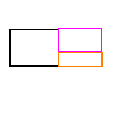
段:
.block {

    float: left;

    display: inline-block;

    margin: auto;

    width: 250px;

    height: 200px;

    border: 3px solid #73AD21;

    padding: 10px;

    margin-left: 300px;

    margin-top: 200px;

}

.block2 {

    float: left;

    display: inline-block;

    margin: auto;

    width: 250px;

    margin-top: 200px;

    border: 3px solid #73AD21;

    padding: 10px;

}

.block3 {

    float: left;

    margin: auto;

    width: 250px;

    height: 200px;

    margin-top: 290px;

    border: 3px solid #73AD21;

    padding: 10px;

}
<div class="container-fluid">
<div class="row">
<div class="col-4-md text-center block">
<h2> Some Text </h2>
</div>
<div class="col-4-md text-center block2">
<h2> Other Text </h2>
</div>
<div class="col-4-md text-center block3">
<h2> More Text </h2>
</div>
</div>
</div>
你能把它的照片?我看不到两个相同尺寸的盒子或你所描述的任何东西。 –
好的,我刚刚添加了一张照片。 – Codes316