1
我创建了3列3格网格。第一段比另外两段有更多的空间。谁能帮忙?如果有帮助,我附上了一张图片。我仍然是编码方面的初学者,所以你会注意到我所做的一些奇怪的事情是不切实际的。CSS奇怪的列段空格
<!doctype html>
<html lang="en">
<head>
<meta charset="utf-8">
<title>Qualenist</title>
<link rel="stylesheet" href="stylesheet.css">
</head>
<body>
<div class="mainBanner">
<div class="menuBox"></div>
<img src="menuBars.png" style="position: absolute; margin-top: 35px; margin-left: 260px;"/>
<h6><span>already a member?</span> Sign in</h6>
<h1>Qualenist</h1>
<h2>Lorem ipsum dolor sit amet & consectetur adipisicing elit</h2>
<div class="divider"></div>
<div class="signUpBox"></div>
<h3>Sign Up</h3>
<h4>learn more</h4>
<img src="downArrow.png" style="display: block; margin-left: auto; margin-right: auto; margin-top: -10px"/>
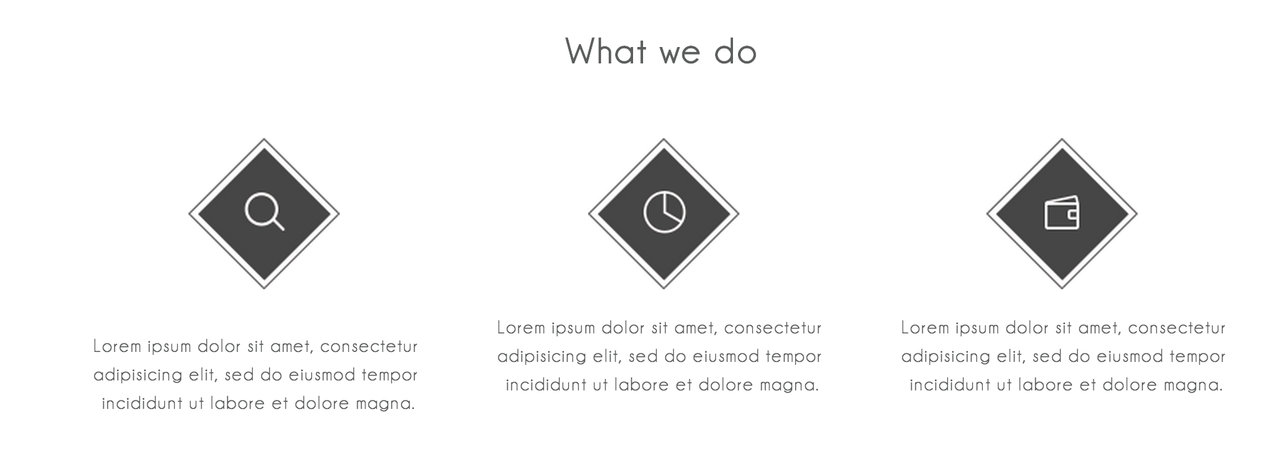
<div class="whatWeDo">
<h5>What we do</h5>
<img src="doSearch.png" style="position: absolute; margin-left: 292px; margin-top: 5px;"/>
<img src="doGraph.png" style="position: absolute; margin-left: 572px; margin-top: 5px;"/>
<img src="doPay.png" style="position: absolute; margin-left: 851px; margin-top: 5px;"/>
<div id="descriptions">
<p>Lorem ipsum dolor sit amet, consectetur <br>
adipisicing elit, sed do eiusmod tempor <br>
incididunt ut labore et dolore magna.</p>
<p>Lorem ipsum dolor sit amet, consectetur <br>
adipisicing elit, sed do eiusmod tempor <br>
incididunt ut labore et dolore magna.</p>
<p>Lorem ipsum dolor sit amet, consectetur <br>
adipisicing elit, sed do eiusmod tempor <br>
incididunt ut labore et dolore magna.</p>
</div>
</div>
<footer class="main-footer">
</footer>
</body>
</html>
.mainBanner {
background-image: url(/Users/omaramin/Documents/Competition/project/mainBanner.png);
background-repeat: no-repeat;
position: absolute;
top: 0;
left: 0;
min-width: 100%;
min-height: 100%;
font-family: Bariol;
color: #ffffff;
border-color: #ffffff;
}
.menuBox {
width: 35px;
height: 35px;
border-style: solid;
margin-top: 25px;
margin-left: 252px;
position: absolute;
border-width: 1px;
border-radius: 2px;
}
h6 {
padding-left: 825px;
letter-spacing: 1px;
font-size: 12px;
}
h6 span {
color: #b3b4b4;
}
h1 {
text-align: center;
padding-top: 90px;
font-size: 36px;
letter-spacing: 1.5px;
font-weight: lighter;
}
h2 {
text-align: center;
margin-top: -15px;
letter-spacing: 1px;
font-size: 13px;
}
.divider {
border: 0;
height: 1px;
width: 45px;
margin: auto;
margin-top: 21px;
background: #ffffff;
}
.signUpBox {
width: 150px;
height: 47px;
border-style: solid;
border-width: 1px;
margin: auto;
margin-top: 25px;
border-radius: 2px;
}
h3 {
text-align: center;
margin-top: -35px;
letter-spacing: 1px;
font-size: 17px;
}
h4 {
text-align: center;
margin-top: 115px;
letter-spacing: 1px;
font-size: 12px;
}
.whatWeDo {
margin-top: -20px;
color: #5c5d5d;
font-family: Bariol;
}
h5 {
text-align: center;
margin-top: 100px;
letter-spacing: 1px;
font-size: 25px;
}
#descriptions {
-moz-column-count: 3;
-moz-column-gap: 0px;
-webkit-column-count: 3;
-webkit-column-gap: 0px;
font-size: 13px;
letter-spacing: 1px;
text-align: center;
margin-left: 200px;
margin-right: 200px;
margin-top: 170px;
line-height: 20px;
}
是存在的,任何机会,在底部的图像中一些额外的空白,造成该段下降一点点? –
没有!问题发生之前,我甚至把图像。 – user2605157
你介意链接到实际网站(如果可能)?这样,用户可以使用他们的网络浏览器的开发工具来玩这个网站,并试图找到解决方案 –