8
我正试图在iPad上使用柔性模型来获得非常简单的布局。iPad上的CSS柔性盒布局
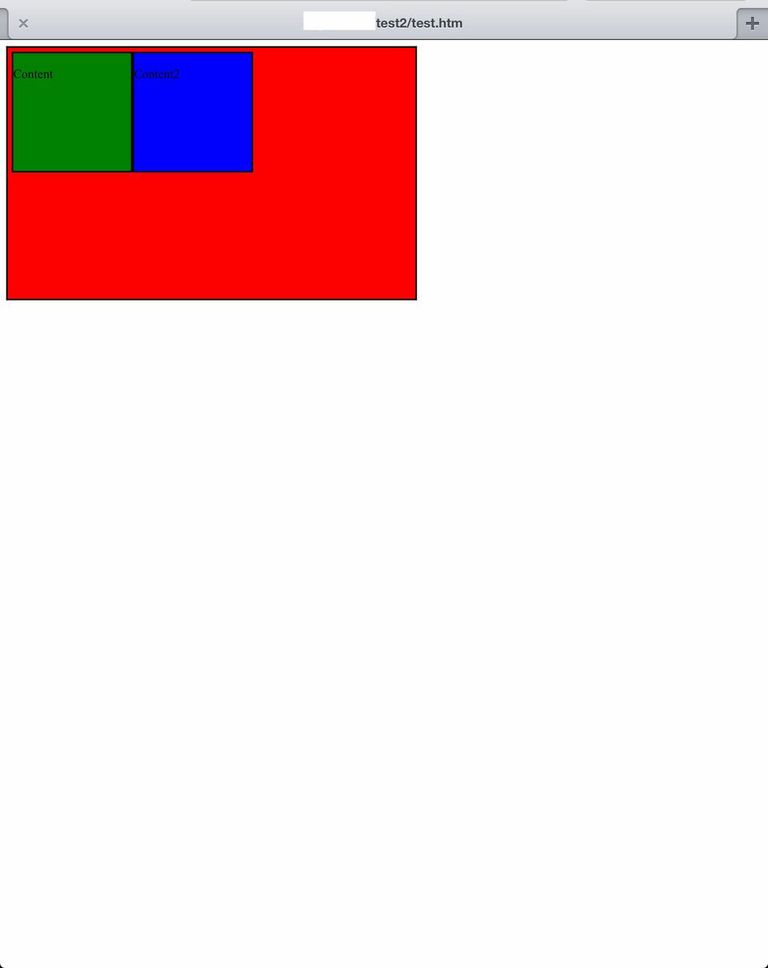
我有一个包含div,应该是中心的内容divs。
除iPad(视网膜)以外,示例代码在所有浏览器和平台上按预期运行。
在线使用各种iPad仿真器不会重现该问题。我只能在实际的iPad上复制它。这里是什么样子的截图:
任何和所有的意见将非常赞赏。
CSS:
.container {
width: 510px;
height: 310px;
background: red;
display: flex;
display: -webkit-flexbox;
display: -ms-flexbox;
display: -webkit-flex;
flex-direction: row;
flex-wrap: wrap;
-webkit-box-pack: center;
-moz-box-pack: center;
-ms-flex-pack: center;
-webkit-justify-content: center;
justify-content: center;
-webkit-flex-align: center;
-ms-flex-align: center;
-webkit-align-items: center;
align-items:center;
border: 2px solid;
padding: 5px;
margin: 0;
}

.content {
float: left;
width: 150px;
height: 150px;
background: green;
border: 2px solid;
padding: 0;
margin: 0;
}

.content2 {
float: left;
width: 150px;
height: 150px;
background: blue;
border: 2px solid;
padding: 0;
margin: 0;
}
HTML:
<div class="container">
<div class="content">
<p>Content</p>
</div>
<div class="content2">
<p>Content2</p>
</div>
</div>
谢谢cimmanon。然而,看着你的ipad的例子,内容div仍然没有居中...... – MNorup
这是对子元素的浮子是罪魁祸首。根据规范,float应该在flex项目上被忽略,但是它会在Webkit 2009的实现中引发奇怪的事情。使用'display:inline-block'代替你的后备。 – cimmanon
你可以使用内联块对齐吗?我现在正在测试视网膜,ipad3和ipad1。无法得到它... – MNorup