2017-06-27 20 views
19

我正在寻找实现这种多重下划线效果,并且发现使用阴影框是最好的方法。具体来说,我想这样做的,是成功的:纯粹的CSS解决方案,动态添加多个阴影框
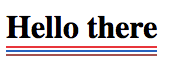
enter image description here

我用下面的CSS来做到这一点:

h1{ 
    box-shadow: 0 2px 0px 0px #F03A47, 0 4px 0px 0px #FFF, 0 6px 0px #276FBF, 0 8px 0px 0px #FFF, 0 10px 0px #AF5B5B; 
    float: left; 
} 

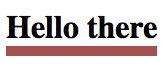
不过,我想达到的效果打开特定的强调上并根据需要关闭。所以,我想出了这一点,并添加类到我的HTML:

h1{ 
    float: left; 
} 
.red{ 
    box-shadow: 0 2px 0px 0px #F03A47, 0 4px 0px 0px #FFF; 
} 
.blue{ 
    box-shadow: 0 6px 0px #276FBF, 0 8px 0px 0px #FFF; 
} 
.brown{ 
    box-shadow: 0 10px 0px #AF5B5B, 0 12px 0px 0px #FFF; 
} 

,但它产生的效果是这样的:

enter image description here

我尝试以不同的顺序添加的类,并且还加入他们动态地使用JavaScript,但我仍然得到相同的结果。我做错了什么,或者有其他方法可以实现开启关闭效果吗?

+0

如此清晰的白色条纹(使用'#fff')是不是一种选择......对吗? –

+1

你不能单独做它们,但你可以为'.red.blue','.red.blue.brown','.red.brown','.blue.brown'等组合制作CSS选择器,等等。另外,我还没有为'box-shadow'尝试过,但是你可以看到[CSS变量](https://developer.mozilla.org/en-US/docs/Web/CSS/Using_CSS_variables)是否会允许您简化每个班级的值。 –

+0

可以调用基于传入的参数添加框阴影的函数吗?例如'addUnderlines(['red','blue'])' –

回答

9

使用<span>小号:)

您可以添加你想要的<span>,只是延长了色彩的有趣的方式CSS中的调色板:

.borders { 
 
    display: inline-block; 
 
} 
 
.borders span { 
 
    display: block; 
 
    height: 2px; 
 
    margin: 2px; 
 
} 
 
.borders span:nth-child(1) { background: red; } 
 
.borders span:nth-child(2) { background: blue; } 
 
.borders span:nth-child(3) { background: green; } 
 
/* Add more here */
<h1 class="borders"> 
 
    Hi there 
 
    <span></span> 
 
    <span></span> 
 
    <span></span> 
 
</h1>

或者,如果只需要3个边界和你不想插入额外的HTML元素:在

关于你的第二类使用border-bottom你的第一个班,比:before:after您第三课。

h1 { 
 
    position: relative; 
 
    display: inline-block; 
 
} 


.red{ 
 
    box-shadow: 0 2px 0 red; 
 
} 


.blue:after, .green:before{ content: ""; position: absolute; width: 100%; left: 0; } 


.blue:after{ 
 
    bottom: -6px; 
 
    border-bottom: 2px solid blue; 
 
} 


.green:before{ 
 
    bottom: -10px; 
 
    border-bottom: 2px solid green; 
 
}
<h1 class="red blue green">Hi there</h1>

+1


的东西与使用表格进行布局基本相同。但更糟糕的是,与布局表不同,它甚至不是有效的。 – BoltClock

+0

@bolt谢谢。流量元素内部绝对允许使用HR。 H1就是这样的元素。块元素。尽管未定义浏览器样式规则,但实际上可以设计HR标签。我应该确实使用了SPAN,但是在这里你走了。找不到任何关于HR的有效参数不被允许或不赞成,因为它只是一个语义上的“分隔符”任何想法? –

+2

https://www.w3.org/TR/html5/sections.html#the-h1,-h2,-h3,-h4,-h5,-and-h6-elements“内容模型:短语内容”。所以H1中不允许HR,因为H1的内容模型并不期望流程元素。 – BoltClock

18

这可能与pseudo elements来完成:

h1 { 
 
    display:inline-block; 
 
    border-bottom:2px solid #e8353b; 
 
    position:relative; 
 
} 
 
    h1:before { 
 
    content:""; 
 
    height:2px; 
 
    width:100%; 
 
    background:#2762be; 
 
    display:block; 
 
    position:absolute; 
 
    bottom:-6px; 
 
    } 
 
    h1:after { 
 
    content:""; 
 
    height:2px; 
 
    width:100%; 
 
    background:#a3514f; 
 
    display:block; 
 
    position:absolute; 
 
    bottom:-10px; 
 
    }
<h1>Hello there</h1>

2

实际上,你可以只用1伪元素做到这一点。

这是我做了什么(关于如何控制间距评论):

h1 { 
 
    display: inline-block; 
 
    /* controls the last line */ 
 
    border-bottom: 2px solid #a3514f; 
 
} 


h1:after { 
 
    content: ""; 
 
    display: block; 
 
    /* controls space between 1st and 2nd line */ 
 
    height: 2px; 
 
    width: 100%; 
 
    /* controls space between 2nd and 3rd line */ 
 
    margin-bottom: 2px; 
 
    border-bottom: 2px solid #2762be; 
 
    border-top: 2px solid #e8353b; 
 
}
<h1>Hello there</h1>


这是基于@APAD1's answer写的,以他的使用边界的想法。

此方法提供整个::after作为<h1>内容的一部分的优点,而不是在外面。

+1

OP问:*'但是,我想达到一个效果,根据需要打开和关闭特定的下划线。'* –

+0

@ RokoC.Buljan删除边框。简单。或者用类控制边界高度。 –

1

您可以使用伪元素和边框添加最多五行。

每个班级添加一个新行。

*, 
 
*:before, 
 
*:after { 
 
    box-sizing: border-box; 
 
} 
 
h1 { 
 
    display: inline-block; 
 
    padding-bottom: 2px; 
 
    position: relative; 
 
} 
 
h1:before, 
 
h1:after { 
 
    content: ""; 
 
    position: absolute; 
 
    left: 0; 
 
    right: 0; 
 
    height: 6px; 
 
    bottom: -10px; 
 
} 
 
h1:after { 
 
    bottom: -18px; 
 
} 
 
.one { 
 
    border-bottom: 2px solid red; 
 
} 
 
.two:before { 
 
    border-top: 2px solid blue; 
 
} 
 
.three:before { 
 
    border-bottom: 2px solid green; 
 
} 
 
.four:after { 
 
    border-top: 2px solid brown; 
 
} 
 
.five:after { 
 
    border-bottom: 2px solid orange; 
 
}
<h1 class="one two three four five">Lorem ipsum</h1>

3

您可以使用linear-gradient,这将是完全透明的。

注意,当结合像你一样类,它们不合并这些值,最后一个属性的元素上设置将覆盖之前,无论他们是在不同的名称类设置与否,因此您线变成全褐色。

body { 
 
    background: lightgray 
 
} 


h1{ 
 
    float: left; 
 
    padding-bottom: 8px; 
 
    background-size: 100% 2px;       /* thickness 2px */ 
 
    background-repeat: no-repeat; 
 
    background-position: 
 
     left bottom, left bottom 4px, left bottom 8px; /* gutter 2px */ 
 
    background-image: 
 
     linear-gradient(to right, blue, blue),   /* bottom line */ 
 
     linear-gradient(to right, green, green),   /* middle line */ 
 
     linear-gradient(to right, red, red);    /* top line */ 
 
    } 


h1.red{ 
 
    background-image: 
 
     linear-gradient(to right, blue, blue), 
 
     linear-gradient(to right, green, green),  
 
     linear-gradient(to right, transparent,transparent); 
 
} 
 
h1.blue{ 
 
    background-image: 
 
     linear-gradient(to right, transparent,transparent), 
 
     linear-gradient(to right, green, green),  
 
     linear-gradient(to right, red, red);  
 
} 
 
h1.green{ 
 
    background-image: 
 
     linear-gradient(to right, blue, blue), 
 
     linear-gradient(to right, transparent,transparent), 
 
     linear-gradient(to right, red, red);  
 
}
<h1>Hello there</h1> 


<h1 class="green">Hello there</h1> 


<h1 class="red">Hello there</h1> 


<h1 class="blue">Hello there</h1>


您可以轻松地重新定位线并关闭所有缝隙通过简单地离开了你不想要的行。

body { 
 
    background: lightgray 
 
} 


h1{ 
 
    float: left; 
 
    padding-bottom: 8px; 
 
    background-size: 100% 2px;       /* thickness 2px */ 
 
    background-repeat: no-repeat; 
 
    background-position: 
 
     left bottom, left bottom 4px, left bottom 8px; /* gutter 2px */ 
 
    background-image: 
 
     linear-gradient(to right, blue, blue),   /* bottom line */ 
 
     linear-gradient(to right, green, green),   /* middle line */ 
 
     linear-gradient(to right, red, red);    /* top line */ 
 
    } 


h1.red{ 
 
    background-image: 
 
     linear-gradient(to right, blue, blue), 
 
     linear-gradient(to right, green, green);  
 
} 
 
h1.blue{ 
 
    background-image: 
 
     linear-gradient(to right, green, green),  
 
     linear-gradient(to right, red, red);  
 
} 
 
h1.green{ 
 
    background-image: 
 
     linear-gradient(to right, blue, blue), 
 
     linear-gradient(to right, red, red);  
 
}
<h1>Hello there</h1> 


<h1 class="green">Hello there</h1> 


<h1 class="red">Hello there</h1> 


<h1 class="blue">Hello there</h1>

0

只是试图让尽可能多的行为更多钞票,使用假点,边框,阴影...

你起床到9号线,可设置/取消与9个独立班。

他们中有些人需要将只对一个坚实的,众所周知的背景色工作(在这种情况下,白色)

.base { 
 
    font-size: 60px; 
 
    position: relative; 
 
    display: inline-block; 
 
} 


.base:before, 
 
.base:after { 
 
    content: ""; 
 
    position: absolute; 
 
    left: 0px; 
 
    width: 100%; 
 
    height: 10px; 
 
    padding: 10px 0px; 
 
    background-clip: content-box; 
 
} 


.base:before { 
 
    bottom: -90px; 
 
} 
 
.base:after { 
 
    bottom: -170px; 
 
} 


.a { 
 
    border-bottom: solid 10px lightgreen; 
 
} 


.b { 
 
    box-shadow: 0px 10px white, 0px 20px green; 
 
} 


.c:before { 
 
    border-top: solid 10px lightblue; 
 
} 


.d:before { 
 
    background-color: red; 
 
} 


.e:before { 
 
    border-bottom: solid 10px yellow; 
 
} 


.f:before { 
 
    box-shadow: 0px 10px white, 0px 20px green; 
 
} 


.g:after { 
 
    border-top: solid 10px tomato; 
 
} 


.h:after { 
 
    background-color: magenta; 
 
} 


.i:after { 
 
    border-bottom: solid 10px gray; 
 
} 


.j:after { 
 
    box-shadow: 0px 10px white, 0px 20px brown; 
 
}
<h1 class="base a b c d e f g h i j">Hello world</h1>