1
我想在导航栏正下方添加背景图像(具有完整的窗口大小宽度)。它不应该覆盖整个页面的长度,而是从导航栏菜单的下方开始,然后下降到特定的指定高度。 (但宽度已满)。在导航栏正下方添加背景图像
我提到以下但仍然没有结果: Starting a background image below navbar in Twitter Bootstrap。我也没有使用任何Bootstrap。
这是我迄今编码,但没有结果:
HTML:
<!DOCTYPE html>
<html>
    <head>
    <title>Numberz</title>
    <link href="https://fonts.googleapis.com/css?family=Open+Sans:400italic,600italic,700italic,400,600,700" rel="stylesheet" type="text/css">
    <link rel="stylesheet" type="text/css" href="style.css">
    <meta http-equiv="content-type" content="text/html; charset=utf-8" />
    </head>

    <body>
    <nav>

     <img src="image2.png" alt="numberz" width="218px" height="38px" style="margin-left: 100px; margin-top: 15px; float: left; display: inline-block;">

     <section style="margin-right: 150px;">
     <ul id="menu">
      <li><a href="#"><b>SIGNUP</b></a></li>
      <li><a href="#"><b>LOGIN</b></a></li>
      <li><a href="#"><b>ACCOUNTANTS</b></a></li>
      <li><a href="#"><b>BLOG</b></a></li>
      <li><a href="#"><b>FEATURES</b></a></li>
      <li><a href="#"><b>PRICING</b></a></li>
     </ul>
     </section>

    </nav>

    <div id="backgroundimage"></div> //this is the division created for the background image

    </body>
</html>
CSS:
ul#menu li {
display: inline-block;
float: right;
position: relative;
margin-top: 28px;
margin-left: 10px;
margin-right: 35px;

}

ul#menu li a {

text-decoration: none;
color: #808080;
font-family: "Helvetica Neue";
font-size: 15px;
}

#backgroundimage {
background: url("image3.png");
width: 1024px;
height: 500px;
background-repeat: no-repeat;
display: block;
position: relative;
background-position: 0 500px;
}
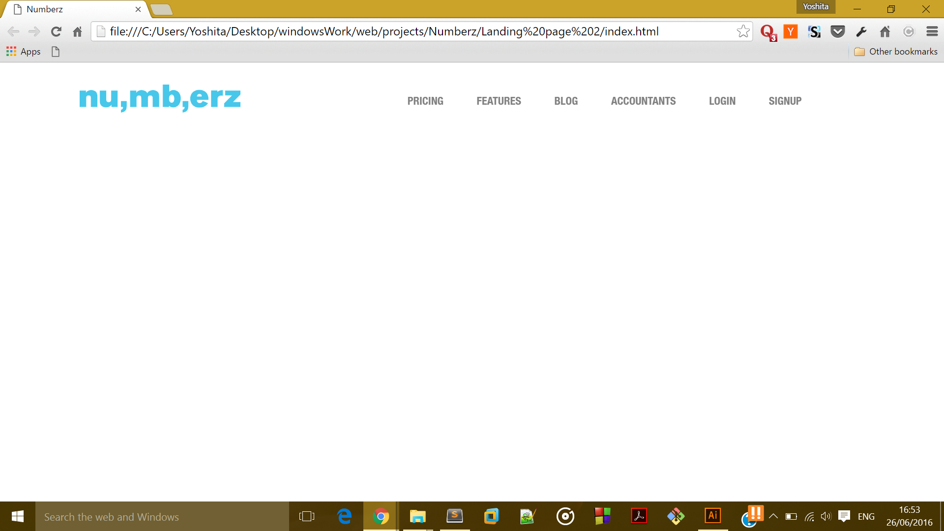
现在它看起来是这样的:
我想是这样的:

任何帮助将不胜感激。

谢谢吨,这工作! :) –
@YoshitaArora不客气。祝你好运! :) –