-1
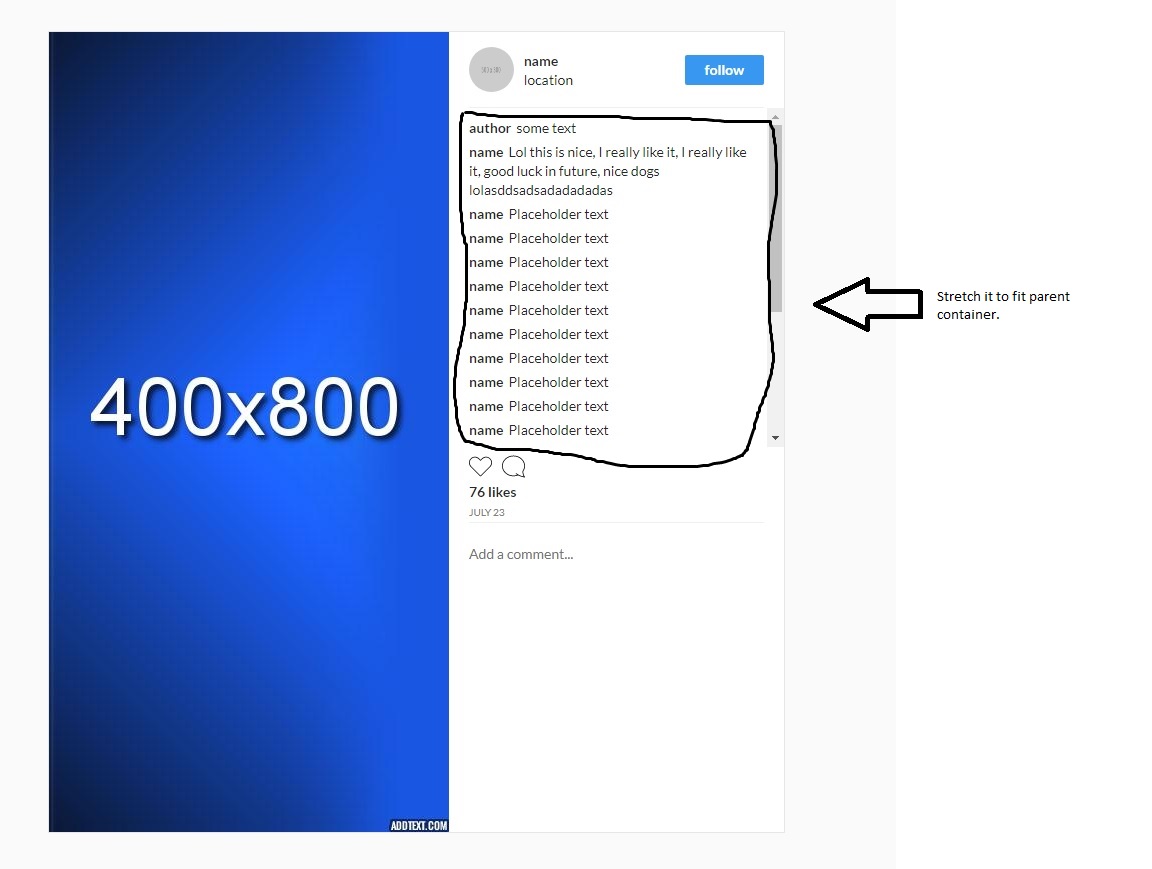
我遇到了问题,我是CSS新手,无法弄清楚如何动态地将注释部分拉伸以适应高度。 正确div的高度是由图像宽度决定的,所以我不能设置正确的div的静态高度,也不能在注释div上设置min-height和max-height,因为它不适合放大图片。拉伸div以适应内容,高度由图像宽度决定
我想要的是以某种方式适合具有与父div高度相关的50%高度的评论部分。
任何想法如何使其工作?有些想法足以展望正确的方向。不要在乎旧的IE版本,所以最新的CSS增加是可行的,如果使用css很麻烦的话,javascript也是一个选项。 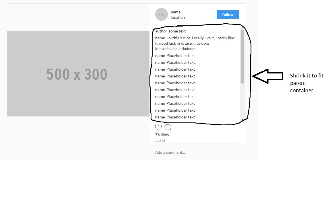
<div class="post-container">
    <div class="image-container">
     <div class="image-holder">
     <img class="image" src="http://www.onionlegal-fortstjohn.ca/wp-content/uploads/2015/03/300x600-Half-Page-Display-Ad-Placeholder.jpg"/>
     </div>
    </div>
    <div class="post-details-container">
     <div class="header">
     <div class="image-container">
      <div class="image-holder">
      <img
       class="profile image"
       src="https://i.stack.imgur.com/7lf40.gif"
      />
      </div>
      </div>
      <ul class="comments-container">
      <li class="comment">
       <span>
       author
       </span>
       <span>
       This is comment text
       </span>
      </li>
      <li class="comment">
       <span>
       author
       </span>
       <span>
       This is comment text
       </span>
      </li>
      <li class="comment">
       <span>
       author
       </span>
       <span>
       This is comment text
       </span>
      </li>
      <li class="comment">
       <span>
       author
       </span>
       <span>
       This is comment text
       </span>
      </li>
      <li class="comment">
       <span>
       author
       </span>
       <span>
       This is comment text
       </span>
      </li>
      <li class="comment">
       <span>
       author
       </span>
       <span>
       This is comment text
       </span>
      </li>
      <li class="comment">
       <span>
       author
       </span>
       <span>
       This is comment text
       </span>
      </li>
      <li class="comment">
       <span>
       author
       </span>
       <span>
       This is comment text
       </span>
      </li>
      <li class="comment">
       <span>
       author
       </span>
       <span>
       This is comment text
       </span>
      </li>
      <li class="comment">
       <span>
       author
       </span>
       <span>
       This is comment text
       </span>
      </li>
      <li class="comment">
       <span>
       author
       </span>
       <span>
       This is comment text
       </span>
      </li>
      <li class="comment">
       <span>
       author
       </span>
       <span>
       This is comment text
       </span>
      </li>
      <li class="comment">
       <span>
       author
       </span>
       <span>
       This is comment text
       </span>
      </li>
      <li class="comment">
       <span>
       author
       </span>
       <span>
       This is comment text
       </span>
      </li>
     </ul>
     <div class="footer">
     FOOTER ALWAYS ON BOTTOM
     </div>
     </div>
CSS
.post-container {
    display: flex;
    border: 1px solid #e6e6e6;
    flex-direction: row;
    max-width: 906px;
    background-color: #fff;
}
.header {
    padding-bottom: 15px;
    padding-top: 15px;
    margin-right: 20px;
    margin-left: 20px;
    flex-direction: row;
    align-items: center;
}
.image {
    height: auto;
    width: 100%;
    height: auto;
    max-width: 100%;
}
.profile {
    width: 45px;
    height: 45px;
    border-radius: 50%;
}

.comments-container {
    list-style-type: none;
    margin: 0;
    padding: 0;
    max-width: 280px;
}
.comment {
    margin-bottom: 15px;
}
.footer {
    bottom: 0;
    position: fixed;
}
没有工具可用于将img转换为HTML,CSS。所以你必须在这里粘贴你的代码 – Sankar