我不知道如何“填充”剪辑,因此我使用代码制作剪辑。让我知道如果你需要更多的帮助,增加更多的属性来控制颜色等 这里所说:
代码:
public class Tabby : HeaderedContentControl
{
    static Tabby()
    {
     DefaultStyleKeyProperty.OverrideMetadata(typeof(Tabby), new FrameworkPropertyMetadata(typeof(Tabby)));
    }

    public double DogEar
    {
     get { return (double)GetValue(DogEarProperty); }
     set { SetValue(DogEarProperty, value); }
    }

    public static readonly DependencyProperty DogEarProperty =
     DependencyProperty.Register("DogEar",
     typeof(double),
     typeof(Tabby),
     new UIPropertyMetadata(8.0, DogEarPropertyChanged));

    private static void DogEarPropertyChanged(
     DependencyObject obj,
     DependencyPropertyChangedEventArgs e)
    {
     ((Tabby)obj).InvalidateVisual();
    }

    public Tabby()
    {
     this.SizeChanged += new SizeChangedEventHandler(Tabby_SizeChanged);
    }

    void Tabby_SizeChanged(object sender, SizeChangedEventArgs e)
    {
     var clip = new PathGeometry();
     clip.Figures = new PathFigureCollection();
     clip.Figures.Add(
      new PathFigure(
       new Point(0, 0),
       new[] {
        new LineSegment(new Point(this.ActualWidth - DogEar, 0), true),
        new LineSegment(new Point(this.ActualWidth, DogEar), true),
        new LineSegment(new Point(this.ActualWidth, this.ActualHeight), true),
        new LineSegment(new Point(0, this.ActualHeight), true) },
       true)
     );
     this.Clip = clip;
    }
}
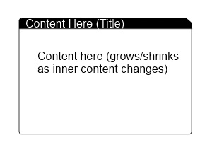
Generic.xaml
<Style TargetType="{x:Type local:Tabby}">
    <Setter Property="Padding"
      Value="5" />
    <Setter Property="Template">
     <Setter.Value>
      <ControlTemplate TargetType="{x:Type local:Tabby}">
       <Grid>
        <Grid.RowDefinitions>
         <RowDefinition Height="auto" />
         <RowDefinition Height="auto" />
        </Grid.RowDefinitions>
        <Border CornerRadius="3,0,0,0"
          BorderBrush="Black"
          BorderThickness="1"
          Background="Black">
         <ContentPresenter Content="{TemplateBinding Header}"
              Margin="{TemplateBinding Padding}" />
        </Border>
        <Border CornerRadius="0,0,3,3"
          BorderBrush="Black"
          BorderThickness="1"
          Background="White"
          Grid.Row="1">

         <ContentPresenter Content="{TemplateBinding Content}"
              Margin="{TemplateBinding Padding}" />
        </Border>
       </Grid>

      </ControlTemplate>
     </Setter.Value>
    </Setter>
</Style>
使用它:
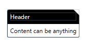
<my:Tabby DogEar="12"
      x:Name="tabby1">
    <my:Tabby.Header>
     <TextBlock Foreground="White">Header</TextBlock>
    </my:Tabby.Header>
    <my:Tabby.Content>
     <TextBlock Text="Content can be anything" />
    </my:Tabby.Content>
</my:Tabby>
完美!这已经死了 - 我所需要的。现在我总是从WPF中重新看到一个问题......您是如何在世界上学会如何提出您所做的事情的?真正以有用的方式学习WPF的资源似乎非常稀缺。 – RubyHaus
五年前,我做了你现在所处的困难部分。我阅读这些书籍,编写了多个项目,犯了错误,并问了其他人(当时并没有那么多人,但我有幸能够接触到一些WPF工作的人)。即使现在我仍然在学习。请进,你会到达那里。 –