2013-03-26 27 views
1

enter image description here有一个标准的页眉页脚布局HTML网页,而无需使用table标签

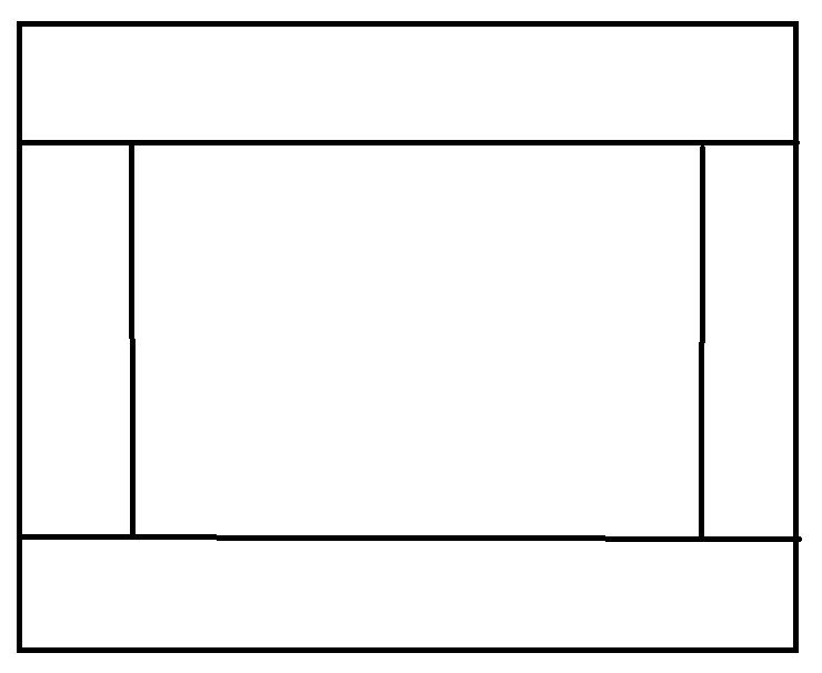
我怎样才能获得最新的图像,而无需使用表中显示?即使浏览器窗口调整大小,我也希望布局跨越整个页面的高度/宽度。

这是我到目前为止尝试过的。它接近,但看起来不专业。

<html> 
<body> 
    <div> 
     <div style="border-style: solid; height: 20%"> 
      Header</div> 
     <div style="overflow: hidden; height: 55%"> 
      <div style="border-style: solid; float: left; width: 20%; height: 100%;"> 
       left</div> 
      <div style="border-style: solid; float: left; width: 57%; height: 100%;"> 
       content</div> 
      <div style="border-style: solid; float: left; width: 20%; height: 100%;"> 
       right</div> 
     </div> 
     <div style="border-style: solid; height: 20%"> 
      Footer</div> 
    </div> 
</body> 
</html> 

干净,简单的CSS将不胜感激。

+0

查找像Twitter Bootstrap这样的网格CSS框架。此外,研究CSS的灵活布局。 – 2013-03-26 02:27:34

+0

你有一个好的开始。我会专注于修改现有代码并将所有样式迁移到外部样式表。你的大纲看起来不像你的形象,因为你需要内容(或需要设置高度),以便它以这种方式出现。 – djthoms 2013-03-26 02:27:47

回答

1

使用position: fixed(ALL)与top: 0px;(顶格),right: 0px;(右格), left: 0px;(左格),bottom: 0px;(下格)沿

固定位置应该在你的情况

帮助

编辑:这里是代码的工作:

<div> 
     <div style="border-style: solid; height: 20%; position: fixed; top: 0px; width: 100%;"> 
      Header 
     </div> 
     <div style="overflow: hidden; height: 55%"> 
      <div style="border-style: solid; float: left; width: 20%; height: 60%; position: fixed; left: 0px; top: 20%;"> 
       left 
      </div> 
      <div style="border-style: solid; float: left; width: 55%; height: 60%; position: fixed; top: 20%; left: 20%;"> 
       content 
      </div> 
      <div style="border-style: solid; float: right; width: 20%; height: 60%; position: fixed; right: 0px; top: 20%;"> 
       right 
      </div> 
     </div> 
     <div style="border-style: solid; height: 20%; position: fixed; bottom: 0px; width: 100%;"> 
      Footer 
     </div> 
    </div> 
+0

搞砸了。 – Foo 2013-03-26 02:29:16

+0

你能告诉我它怎么错过了?我的意思是应用此代码后的布局如何? – 2013-03-26 02:31:17

+1

您应该阅读[固定定位](http://www.w3.org/wiki/CSS_absolute_and_fixed_positioning)以了解它,@Foo – djthoms 2013-03-26 02:31:41

5

富,你需要做的是得到一个良好的基础在尝试这个之前在HTML和CSS中。理想情况下,您希望避免内联样式(例如style="border: 1px solid black;")。你不需要固定或绝对定位来实现这一点。基本的HTML/CSS技术是完全可行的。这里是一个替代的解决方案,以你的要求:

<div class="header"> 
    <div class="header-inner"></div>  
</div> 
<div class="content"> 
    <div class="sidebar left"> 
     <div class="sidebar-inner"></div> 
    </div> 
    <div class="content-inner"></div> 
    <div class="sidebar right"> 
     <div class="sidebar-inner"></div> 
    </div> 
</div> 
<div class="footer"> 
    <div class="footer-inner"></div> 
</div> 

而CSS:

/* Temp styles */ 
.header, .sidebar, .content, .footer { border: 5px solid black; } 
.content, .sidebar, .footer { border-top: none; } 
.sidebar.right { border-right: none; } 
.sidebar.left { border-left: none; } 
/* Core styles */ 
.header { 
    position: relative; /* needed for stacking */ 
    height: 100px; 
    width: 100%; 
} 
.content { 
    position: relative; /* needed for stacking */ 
    width: 100%; 
    height: 500px; 
} 
.sidebar { 
    position: relative; /* needed for stacking */ 
    width: 20%; 
    height: 100%; 
    border-top: none; 
} 
.sidebar.left { float: left; } 
.sidebar.left:after, 
.sidebar.right:after { 
    clear: both; 
    content: "\0020"; 
    display: block; 
    overflow: hidden; 
} 
.sidebar.right { float: right; } 
.footer { 
    position: relative; /* needed for stacking */ 
    width: 100%; 
    height: 100px; 
} 

这里是一个demo。采取这个演示,并从中吸取教训!希望这可以帮助!

+2

这不符合横跨整个页面的高度的标准。你的高度硬编码为500px; – d512 2013-08-27 22:06:04

+1

这是不言自明的是,固定高度值仅是为了显示的原因。我想象中的提问是能够以小博大,这是仅用于演示的原因。 – djthoms 2013-08-28 04:35:29

+0

卸下固定高度将移动页脚起来。他希望布局“跨越整个高度”。 – armin 2015-01-29 14:07:29

0

CSS:

#header 
{ 
position:fixed; 
top:0px; 
left:0px; 
right:0px; 
height:20%; 
overflow:hidden; 
} 
#leftSide 
{ 
position:fixed; 
top:21%; 
left:0px; 
width:20%; 
bottom:21%; 
} 
#rightSide 
{ 
position:fixed; 
top:21%; 
right:0px; 
width:20%; 
bottom:21%; 
} 
#footer 
{ 
position:fixed; 
height:20%; 
left:0px; 
right:0px; 
bottom:0px; 
} 
#content 
{ 
position:fixed; 
top:21%; 
bottom:21%; 
left:21%; 
width:57%; 
} 
div {display:block; border:1px solid black;} 

HTML:

<div id="header">header</div> 
<div id="leftSide">left</div> 
<div id="content">content</div> 
<div id="rightSide">right</div> 
<div id="footer">footer</div> 

在这个例子中,我使用fixedposition,但您可以设置overflow-xoverflow-y为每本的div的。例如: :对于content,您可以对每个格使用overflow-x:hiddenoverflow-y:autoscroll等。 当然,在这个例子中页面将不可滚动。

0

我想你现在已经想出了一个解决方案,因为问题已经接近两年了。然而,其他人可能偶然发现这篇文章,所以这是供将来参考:

Take a look at this answer and check the JSFiddles。这是一个使用CSS表格的相对稳固的解决方案(没有HTML布局表格)。