2017-07-24 36 views
5

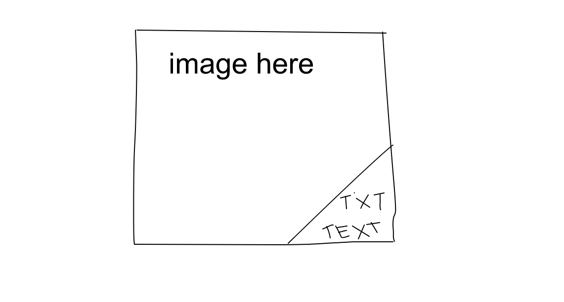
所以,我想在图像上使用CSS放置三角形,正好是包含一些文本的三角形。事情是这样的:在图像上放置文字的形状

https://sketch.io/render/sk-11fa7e2aeba09cb08372f831f84d9af2.jpeg enter image description here

我有点卡住,所以这里就是我现在:

.image { 
    background: url('../image.jpg'); 
    background-repeat: no-repeat; 
    background-size: cover; 
    position: relative; 
    overflow: hidden; 

    & .text { 
     position: absolute; 
     background-color: #FFF; 
     bottom: 0; 
     right: 0; 
     padding: 10px 20px; 
    } 
} 

<div class="image"> 
    <span class="text"> 
     <p>Text here</p> 
     <p>And here</p> 
    </span> 
</div> 

我如何可以旋转/角/缩小的左侧框..?

非常感谢您的帮助!

回答

2

您可以在底角使用translateY()父的伪元素,rotate()它,而且它。

body { 
 
    max-width: 320px; 
 
} 


.image { 
 
    background: url("https://lh3.googleusercontent.com/-QPadFFLbBGA/AAAAAAAAAAI/AAAAAAAADB8/FkNCMP_vkAc/photo.jpg?sz=328"); 
 
    background-repeat: no-repeat; 
 
    background-size: cover; 
 
    position: relative; 
 
    overflow: hidden; 
 
    padding-bottom: 100%; 
 
} 
 
.image .text { 
 
    position: absolute; 
 
    bottom: 0; 
 
    right: 0; 
 
    padding: 10px 20px; 
 
} 
 
.image::before { 
 
    content: ''; 
 
    background: white; 
 
    position: absolute; 
 
    top: 0; 
 
    left: 0; 
 
    bottom: 0; 
 
    right: 0; 
 
    transform: rotate(-45deg) translateY(75%); 
 
}
<div class="image"> 
 
    <span class="text"> 
 
     <p>Text here</p> 
 
     <p>And here</p> 
 
    </span> 
 
</div>

2

使用linear gradient创建三角形,并使用填充topleft使三角形足够大以供文本使用。

.image { 
 
    width: 200px; 
 
    height: 200px; 
 
    background: url(http://lorempixel.com/200/200/animals/); 
 
    background-repeat: no-repeat; 
 
    background-size: cover; 
 
    position: relative; 
 
    overflow: hidden; 
 
} 


.text { 
 
    position: absolute; 
 
    background: linear-gradient(to bottom right, transparent 50%, white 51%); 
 
    bottom: 0; 
 
    right: 0; 
 
    padding: 60px 0 0 60px; 
 
    text-align: right; 
 
    white-space: nowrap; 
 
}
<div class="image"> 
 
    <span class="text"> 
 
     <p>Text here</p> 
 
     <p>Something longer</p> 
 
    </span> 
 
</div>

+0

有趣的解决方案...谢谢!我注意到它看起来有点像素化(线条不是100%直线且平滑) - 是否有您知道的解决方法? – Smithy

+0

解决方法是在色块之间有一个小间隙。 –

1

您可以使用.image::before::after属性的边界,使你的右下角的三角形。

.image { 
 
    height:300px; 
 
    width:300px; 
 
    background-image: url('http://lorempixel.com/300/300/'); 
 
    background-repeat: no-repeat; 
 
    background-size: cover; 
 
    position: relative; 
 
    overflow: hidden; 
 
} 


.image::before, 
 
.image::after { 
 
    content: ''; 
 
    position: absolute; 
 
    bottom: 0; 
 
    right: 0; 
 
    border-color: transparent; 
 
    border-style: solid; 
 
} 


.image::before { 
 
    border-width: 1.5em; 
 
} 


.image::after { 
 
    border-width: 3.35em; /* makes triangle bigger */ 
 
    border-bottom-color: #fff; 
 
    border-right-color: #fff; 
 
} 


.text { 
 
    position:absolute; 
 
    bottom:0; 
 
    right:0; 
 
    z-index:1; 
 
} 


p { 
 
    margin-top: 0px; 
 
    margin-bottom: 0px; 
 
}
<div class="image"> 
 
    <span class="text"> 
 
     <p>Text here</p> 
 
     <p>And here</p> 
 
    </span> 
 
</div>