2
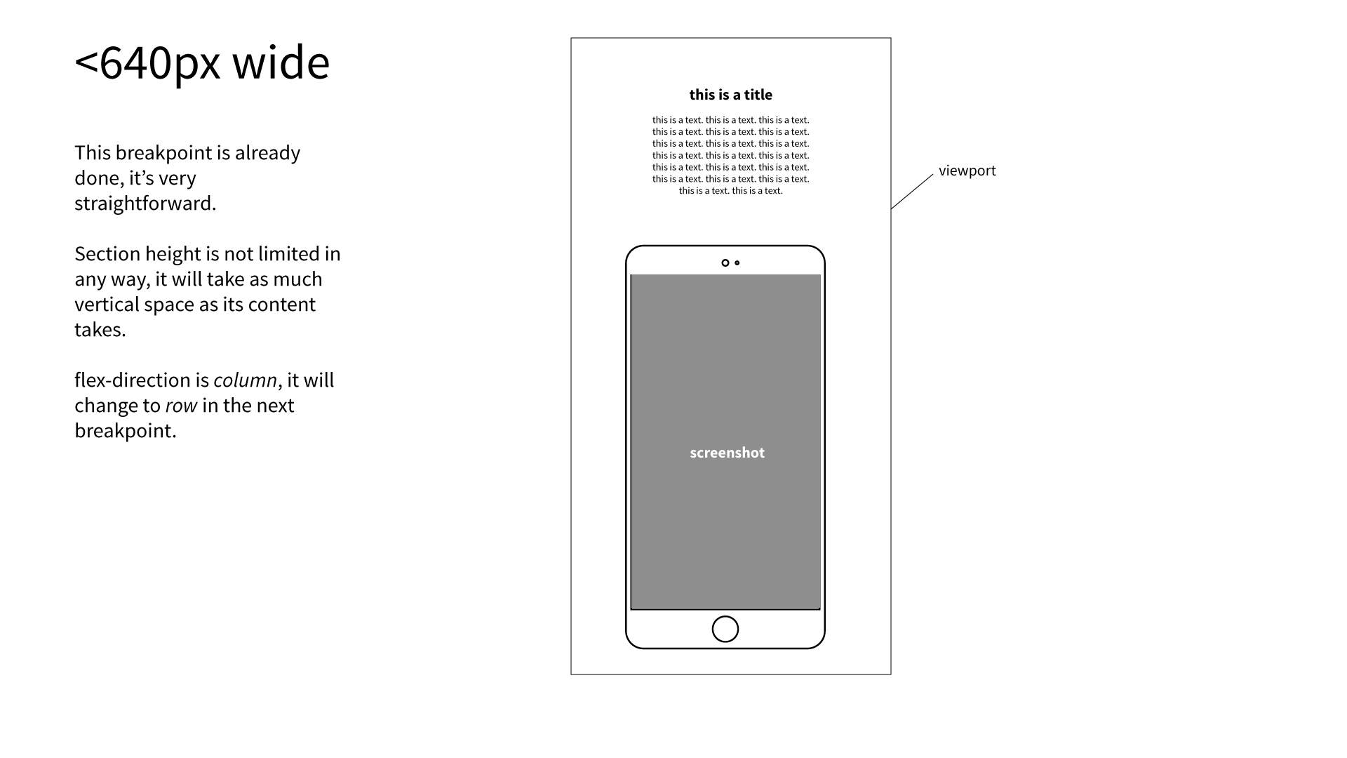
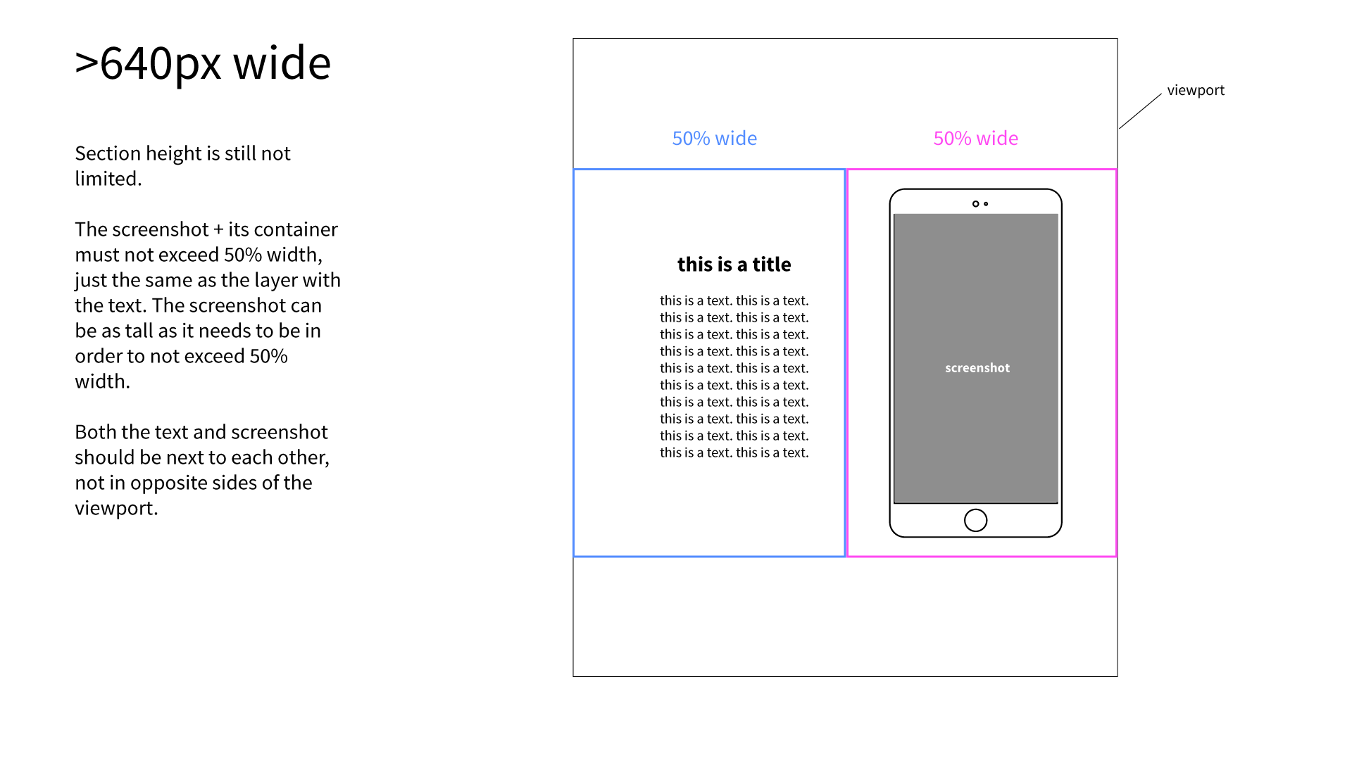
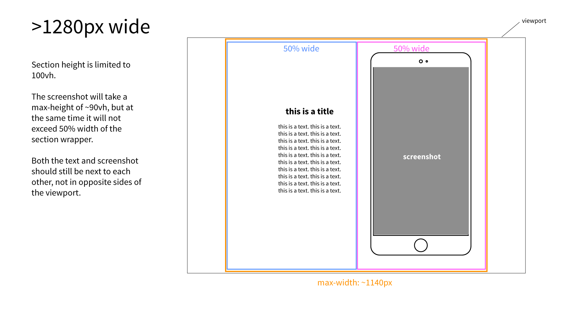
我正在制作一个典型的移动应用展示单页,并且我无法使应用截图示例适合装有智能手机的容器大纲背景,然后让它们中的2个不超过视口高度(我正在处理的特定部分的高度为100vh)。在Flexbox布局中制作图像+容器高度不超过100vh单位
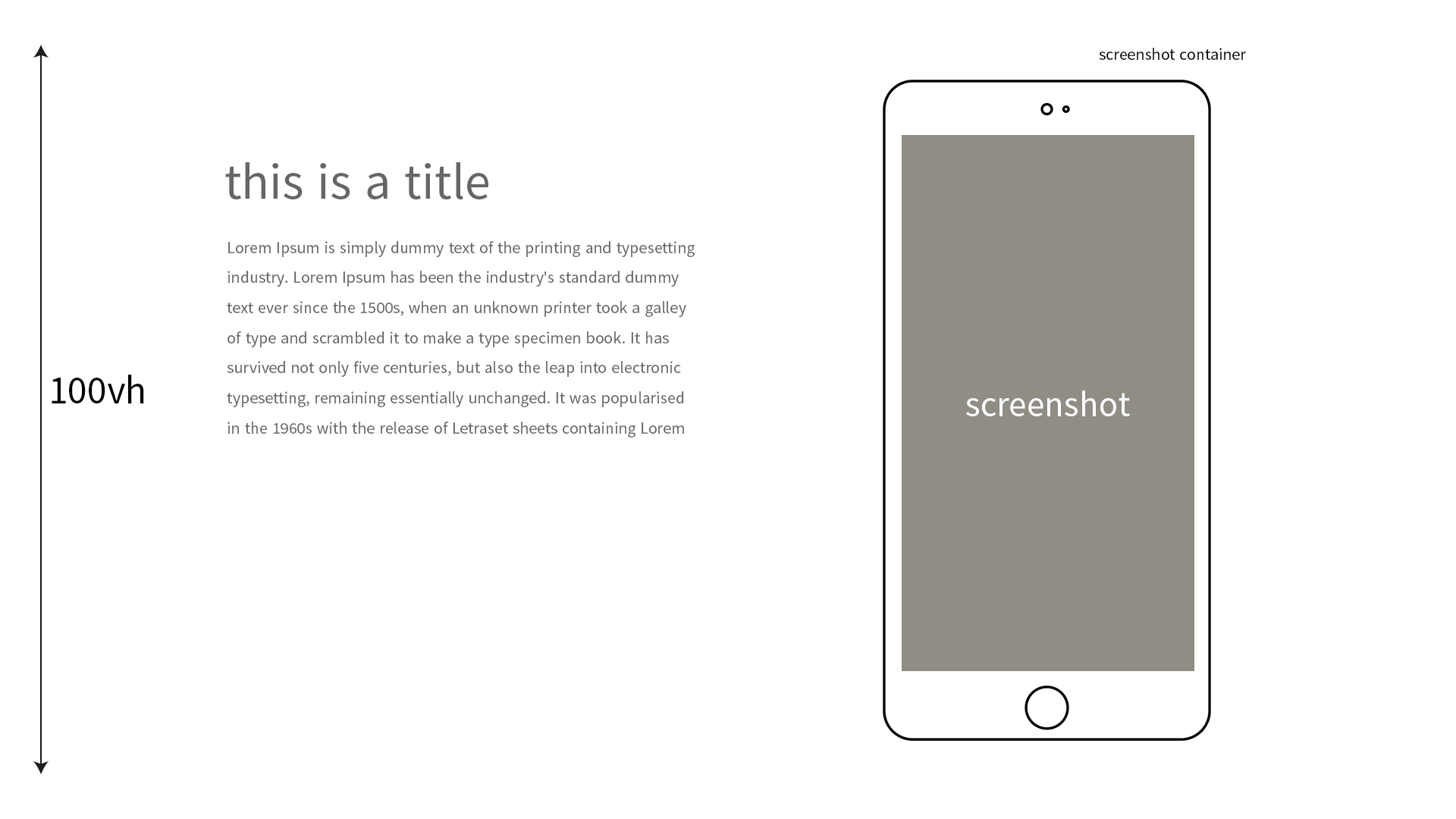
解释的图像,这就是我所追求的:
一直在努力的事情终日不能似乎能够解决它。我明白我的问题在于截图容器和img的某处。由于这是flexbox,并且父级将其子级放在一行中,所以img容器占用宽度的50%,并且由于它具有背景大小:包含集,所以其背景恰好适合其高度。但是当img被渲染时,它占据了它的父容器的100%,这是容器的50%,这是它的容器的宽度的50%。那么,怎样才能让图像适应其父母的高度,并调整宽度以及正确的宽高比?
HTML
<section>
<div class="section-wrapper">
<div class="section-texts-wrapper">
<div class="section-texts-icon">
<img src="http://placehold.it/200x50" alt="Create">
</div>
<div class="section-texts-content">
<p><strong>This is a subtitle.</strong></p>
<p>This is some text. This is some text. This is some text. This is some text. This is some text. </p>
<p>This is some text. This is some text. This is some text. This is some text. This is some text. This is some text. This is some text.</p>
</div>
</div>
<div class="section-screenshot">
<img src="http://placehold.it/750x1334">
</div>
</div>
</section>
CSS
html {background-color: #000;}

section {
margin: 0;
width: 100%;
height: 100vh;

background-color: #333;
color: #999;
}

.section-wrapper {
display: flex;
flex-direction: row;
justify-content: space-between;
align-items: center;
padding: 20px;
height: 100%;
}

.section-screenshot {
background: url(https://dl.dropboxusercontent.com/s/rn2y4x2zyjuoq0i/phone_outline.svg?dl=0) center top no-repeat;
background-size: contain;
text-align: center;
max-height: 90vh;
}

.section-screenshot img {
width: 70%;
padding: 15% 0 15%;
opacity: 0.6;

}
下面是一个与基本布局codepen:https://codepen.io/mrmerrick/pen/KNvRoy
编辑 - 这里有什么我一些更直观的解释之后。
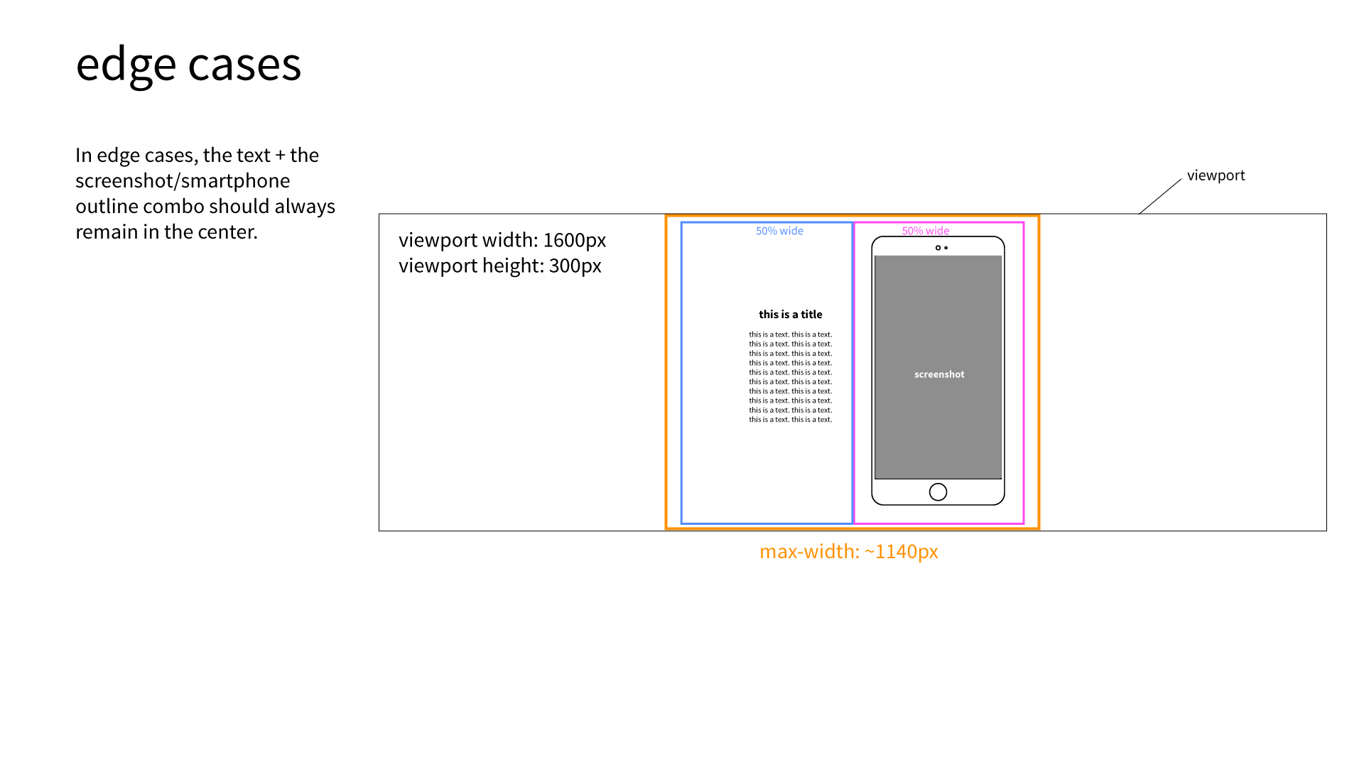
首先,感谢回答。大多数情况下,这是可行的,但它不是一个通用的解决方案:尝试水平调整浏览器的大小:当空间太窄时,容器会缩小,而图像忽略这一点,重叠它。我正在寻找一种方式来创建一个由容器和图像组成的“始终响应式对象”。 另外,如果你能解释为什么你的解决方案能够理解底层技术,我会非常感激。为什么要强制50%的宽度?为什么在拆除容器时容器所需的最大高度没有区别?等.. – MrMerrick
编辑我的答案给你。 –
再次感谢!这样效果更好,但它仍然不是一个适当的响应式解决方案。尝试使浏览器窗口变得狭窄和高度:截图的宽度比使用文本的区域的宽度更宽,当它们都应该是flex flex父指令的50%时。必须通过纯CSS来解决这个问题。也许容器+截图组合需要一个包装它?这看起来很简单,但很难得到正确的结果:\ – MrMerrick