这是相当接近你想要
<Border Background="#363636"
     BorderThickness="10">
    <TabControl>
     <TabControl.Resources>
      <Style TargetType="TabItem">
       <Setter Property="TextElement.Foreground"
         Value="White" />
       <Setter Property="TextElement.FontSize"
         Value="16" />
       <Setter Property="Background"
         Value="#363636" />
       <Setter Property="Template">
        <Setter.Value>
         <ControlTemplate TargetType="TabItem">
          <Border Background="{TemplateBinding Background}">
           <ContentPresenter ContentSource="Header" Margin="10,5" />
          </Border>
          <ControlTemplate.Triggers>
           <Trigger Property="IsSelected"
             Value="true">
            <Setter Property="TextElement.Foreground"
              Value="Black" />
            <Setter Property="Background"
              Value="White" />
           </Trigger>
          </ControlTemplate.Triggers>
         </ControlTemplate>
        </Setter.Value>
       </Setter>
      </Style>
     </TabControl.Resources>
     <TabItem Header="red">
      <Label Content="Content goes here..." />
     </TabItem>
     <TabItem Header="green">
      <Label Content="Content goes here..." />
     </TabItem>
     <TabItem Header="blue">
      <Label Content="Content goes here..." />
     </TabItem>
    </TabControl>
</Border>
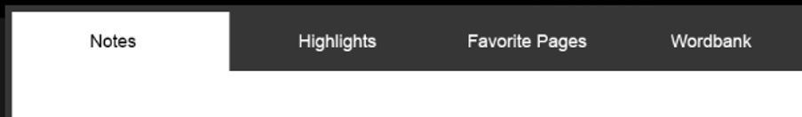
进一步匹配的内容,我们可能需要重写标签控件模板以及
更新
我试图密切配合它你的要求
结果

XAML
<Border Background="#363636"
     Margin="4"
     CornerRadius="4">
    <TabControl>
     <TabControl.Resources>
      <Style TargetType="TabItem">
       <Setter Property="TextElement.Foreground"
         Value="White" />
       <Setter Property="TextElement.FontSize"
         Value="16" />
       <Setter Property="TextElement.FontWeight"
         Value="SemiBold" />
       <Setter Property="Background"
         Value="#363636" />
       <Setter Property="BorderBrush"
         Value="{x:Null}" />
       <Setter Property="BorderThickness"
         Value="0" />
       <Setter Property="Template">
        <Setter.Value>
         <ControlTemplate TargetType="TabItem">
          <Border x:Name="back"
            CornerRadius="4,4,0,0"
            Background="{TemplateBinding Background}">
           <ContentPresenter ContentSource="Header"
                Margin="20,10" />
          </Border>
          <ControlTemplate.Triggers>
           <Trigger Property="IsSelected"
             Value="true">
            <Setter Property="TextElement.Foreground"
              Value="Black" />
            <Setter Property="Background"
              Value="White" />
           </Trigger>
          </ControlTemplate.Triggers>
         </ControlTemplate>
        </Setter.Value>
       </Setter>
      </Style>
     </TabControl.Resources>
     <TabItem Header="red">
      <Label Content="Content goes here..." />
     </TabItem>
     <TabItem Header="green">
      <Label Content="Content goes here..." />
     </TabItem>
     <TabItem Header="blue">
      <Label Content="Content goes here..." />
     </TabItem>
     <TabControl.Template>
      <ControlTemplate TargetType="TabControl">
       <Grid KeyboardNavigation.TabNavigation="Local" Margin="4">
        <Grid.RowDefinitions>
         <RowDefinition Height="Auto" />
         <RowDefinition Height="*" />
        </Grid.RowDefinitions>
        <TabPanel x:Name="HeaderPanel"
           Grid.Row="0"
           Panel.ZIndex="1"
           IsItemsHost="True"
           KeyboardNavigation.TabIndex="1" />
        <Border x:Name="Border"
          RenderOptions.EdgeMode="Aliased"
          Grid.Row="1"
          KeyboardNavigation.TabNavigation="Local"
          KeyboardNavigation.DirectionalNavigation="Contained"
          KeyboardNavigation.TabIndex="2"
          Background="White"
          CornerRadius="0,0,2,2">

         <ContentPresenter x:Name="PART_SelectedContentHost"
              RenderOptions.EdgeMode="Unspecified"
              Margin="4"
              ContentSource="SelectedContent" />
        </Border>
       </Grid>
      </ControlTemplate>
     </TabControl.Template>
    </TabControl>
</Border>

您可能需要重写为标签项目的模板。 – pushpraj