-2
我不是很擅长用文字描述这个问题,所以我画了一个布局应该具有的属性的小图片。如何实现这种CSS布局?
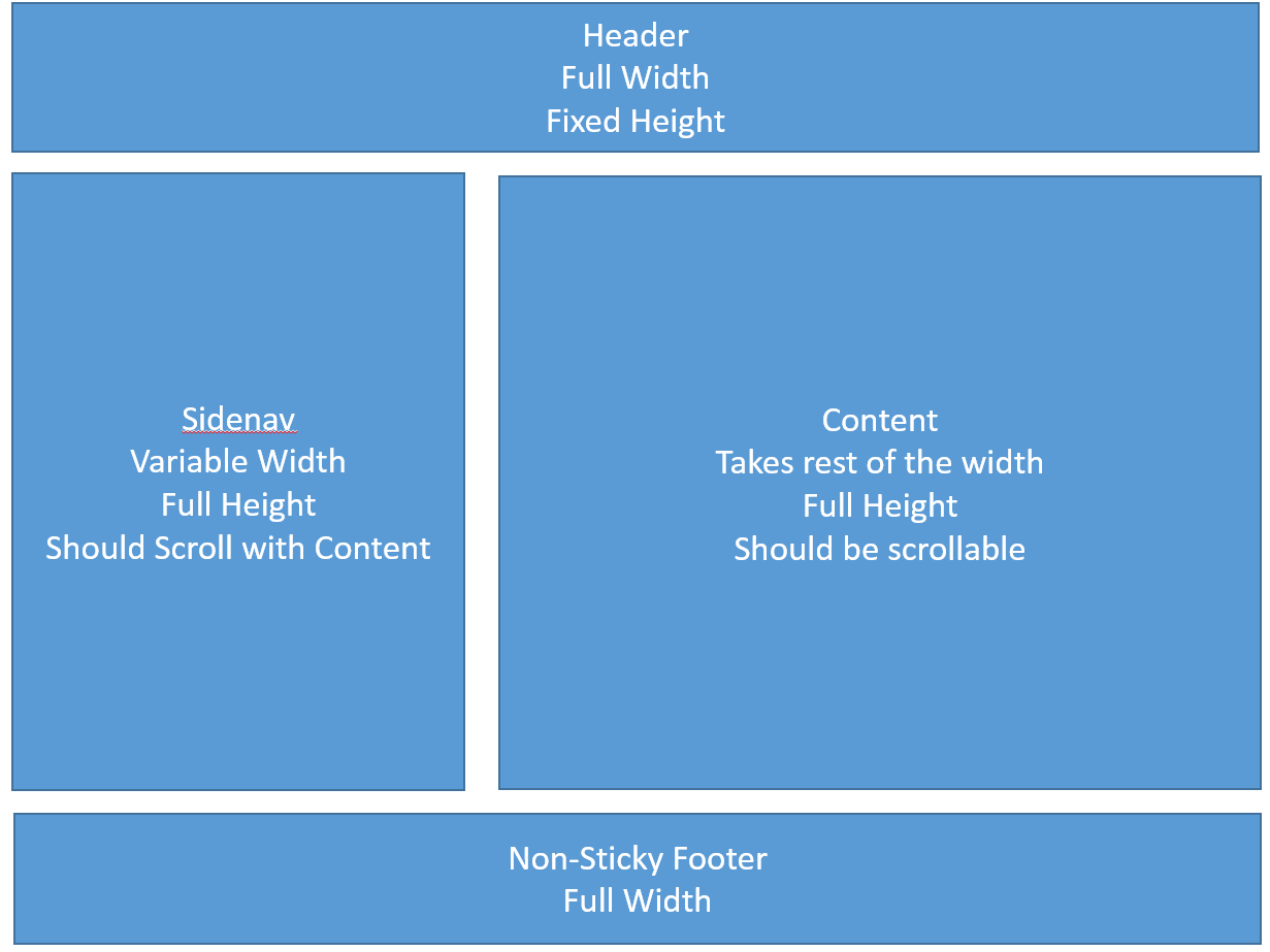
我尝试了几种可能性,但我没能实现这个没有绝对定位和flexboxes。我对css hacks也不是很熟悉。
有没有人有这种类型的布局与CSS只有和IE9 +(如果可能的话IE8)兼容性的解决方案?
在此先感谢
我不是很擅长用文字描述这个问题,所以我画了一个布局应该具有的属性的小图片。如何实现这种CSS布局?
我尝试了几种可能性,但我没能实现这个没有绝对定位和flexboxes。我对css hacks也不是很熟悉。
有没有人有这种类型的布局与CSS只有和IE9 +(如果可能的话IE8)兼容性的解决方案?
在此先感谢
这里是我的解决办法,运气好兄弟,欢迎到前端的世界。
HTML:
<body>
    <div class="wrapper">
     <div id="header"></div>
     <div id = "content">
      <div class="sidenav"></div>
      <div class="info"></div>
     </div>
     <div id="footer"></div>
    </div>
</body>
CSS:
body {
    width: 100%;
    height: 100%;
    margin: 0;
    padding: 0;
}

.wrapper {
    min-height:100%;
    position:relative;
}

#header {
    position: fixed;
    top: 0;
    z-index: 9999;
    padding-left: 0;
    padding-right: 0;
    width: 100%;
    height: 4em;
    background: navy;
}

#footer {
    width: 100%;
    height: 4em;
    position: absolute;
    bottom: 0;
    left: 0;
    background-color: pink;
}

#content {
    width: 100%;
    height: 2000px;
    display: inline-block;
    padding-top: 4em; /*same height header*/
    margin-top: 1em;
    margin-bottom: 1em;
    padding-bottom: 4em;
    /* or:
    padding: 4em 0 4em 0;
    margin: 1em 0 1em 0;
    */
}

.sidenav {
    float:left;
    width:500px;
    height: 100%;
    background-color: gray;
    margin-right: 1em;
}

.info {
    overflow:hidden;
    height: 100%;
    background-color: purple;
}
这很简单。
HTML
<header>
</header>

<section>

    <aside>
    </aside>

    <article>
    </article>

</section>

<footer>
</footer>
CSS
footer,
header {
    width: 100%;
}
section {
    width: 100%;
}
section:after {
    display: table;
    content: '';
    clear: both;
}
aside {
    width: 30%;
    float: left;
}
article {
    width: 60%;
    float: right;
}
谢谢你的时间和精力。我带了Gilberto的anwser,因为它在不指定宽度的情况下保持了灵活性,并且不使用表格进行对齐。 – Megamind
哪里是你的代码?你有什么尝试?你遇到什么问题? – Shaggy
创建此布局有许多可能性,但是您需要向我们展示您尝试的内容。我们不是免费的代码写作服务。 – j08691