1
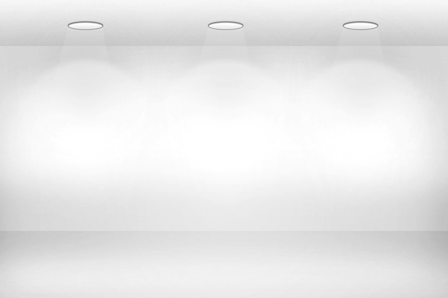
我在网上找到这张图片,我很想在我的网站上做这个效果。 我想要有一个较暗的背景,顶部的灯如图片和它下面的图片。但我希望它看起来像灯上的灯光照在一张照片上。 这可能吗?
我在网上找到这张图片,我很想在我的网站上做这个效果。 我想要有一个较暗的背景,顶部的灯如图片和它下面的图片。但我希望它看起来像灯上的灯光照在一张照片上。 这可能吗?
添加不透明度:0.9;或不透明度:0.3;您较暗的背景图片的风格.. 希望这有助于公司...
嗯,我还没有背景图片。我使用上面的图片作为背景图片。但我想有一个不同的背景,只是灯上的效果。 – user3353335
您可以使用像@Eamonn透明的PNG图片说或使用梯度和CSS阴影像下面的示例:
<style type="text/css">
.light {
    width: 200px;
    height: 200px;
    border-top-left-radius: 50%;
    border-top-right-radius: 50%;
    border-bottom-left-radius: 20%;
    border-bottom-right-radius: 20%;
    box-shadow: 0 20px 20px 5px #fff;
    background: -moz-linear-gradient(top, rgba(255,255,255,0) 0%, rgba(255,255,255,0) 1%, rgba(255,255,255,0.7) 66%, rgba(255,255,255,0.79) 76%, rgba(255,255,255,1) 99%); /* FF3.6-15 */
    background: -webkit-linear-gradient(top, rgba(255,255,255,0) 0%,rgba(255,255,255,0) 1%,rgba(255,255,255,0.7) 66%,rgba(255,255,255,0.79) 76%,rgba(255,255,255,1) 99%); /* Chrome10-25,Safari5.1-6 */
    background: linear-gradient(to bottom, rgba(255,255,255,0) 0%,rgba(255,255,255,0) 1%,rgba(255,255,255,0.7) 66%,rgba(255,255,255,0.79) 76%,rgba(255,255,255,1) 99%); /* W3C, IE10+, FF16+, Chrome26+, Opera12+, Safari7+ */
    filter: progid:DXImageTransform.Microsoft.gradient(startColorstr='#00ffffff', endColorstr='#ffffff',GradientType=0); /* IE6-9 */
</style>
<div class="light"></div>
可以使用一些伪元素来产生这种效果,其中包括一个线性梯度和变换:
演示[悬停图像看到效果]
.light {

    position: relative;

    height: 300px;

    width: 300px;

    display: inline-block;

    margin-top: 20px;

}


.light img {/*Image inside*/

    position: absolute;

    top: 0;

    left: 0;

    height: 100%;

    width: 100%;

}


.light:before {/*creates the bulb*/

    content: "";

    position: absolute;

    bottom: 100%;/*places above image*/

    left: 50%;

    height: 20px;

    width: 100px;

    border-radius: 50%;

    background: lightgray;

    transform: translateX(-50%);/*places in center of image*/

    z-index: 10;/*places in front of image*/

    border: 2px solid dimgray;/*borders add 3D effect to bulb*/

    border-bottom: none;

    border-top: 5px solid #222;

}


.light:after {/*creates the beam*/

    content: "";

    position: absolute;

    transition: all 0.4s;

    height: 0;

    width: 100px;

    top: -10px;

    left: 50%;

    transform: translateX(-50%) perspective(400px) rotateX(45deg);/*centers, makes as trapezium*/

    transform-origin: top center;

    background: linear-gradient(0deg, transparent, rgba(255, 255, 255, 0.8));/*adds fading light*/

    z-index: 5;/*places in front of image, but behind bulb*/

}


.light:hover:after {/*demo only, add this to .light:after in production*/

    height: 80%;

}
<div class="light">
<img src="http://lorempixel.com/300/300" />
</div>非常感谢你,这太酷了。你是如何制作这样的光影的?我希望灯光能够保持在画面上,而不是悬停在画面上。 – user3353335
而不是在悬停状态下声明'height:80%;'将其放在'.light:after' css定义中。灯'灯'是在'.light:before'中制作的,而灯'beam'则是在'light:'css – jbutler483
中制作的。但是我不需要首先看到灯泡的实际图片吗? – user3353335
只要有照明效果的透明'png'并把它放在你的图片显示的顶部。真的很简单。 – Eamonn
就像在灯和光的透明画面中一样?但是如果我把这张照片放在我的照片上,那它会不会覆盖画廊的照片? – user3353335
如果它确实是透明的,它就会将效果放在最上面。像Photoshop中的图层或其他东西。 – Eamonn