5
我目前在一个容器中有元素,每个容器都包含一个图像。我想使用flexbox将这些分布到四角或容器中。图像水平分布正确,但不会垂直占用所有可用空间。使Flexbox中的项目占据所有垂直和水平空间
这里是什么样子的时刻: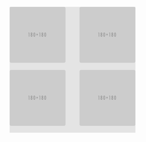
这里是我的标记:
<div class="container">
    <div class="photo">
     <img src="https://placehold.it/180">
    </div>
    <div class="photo">
     <img src="https://placehold.it/180">
    </div>
    <div class="photo">
     <img src="https://placehold.it/180">
    </div>
    <div class="photo">
     <img src="https://placehold.it/180">
    </div>
</div>
我的(S)CSS:
div.container {
    width: 405px;
    height: 405px;
    background: rgba(0,0,0,0.1);
    display: flex;
    flex-wrap: wrap;
    justify-content: space-between;

    div.photo {
     width: 180px;
     height: 180px;
     overflow: hidden;
     border-radius: 5px;

     img {
      height: 100%;
     }
    }
}
该解决方案领导flexmodel到荒谬的。结果是一个静态大小。 Flex应该在那里处理动态变量。对于这个结果,flex是不必要的。 –
@JanNahody嘿,这是没有理由downvote! – kukkuz
Upvote显示有效的解决方案。但这不是一个。对不起 –