0
让我们说我有四个<p>和所有<p>元素浮动到左,但第二<p>的身高超过别人,如下图: 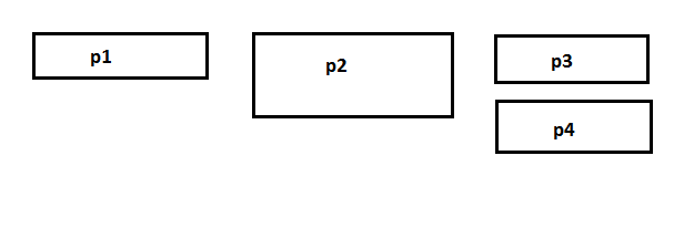 在HTML中并排浮动多个元素侧
我不明白的是,为什么p4不在p1下?为什么它在p3下?你可能会说p2因为它的高度而妨碍了,但是为什么p4必须从当前位置移动到p1下的位置,不能将p4直接放在p1下,并且与高度无关p2的?
让我们说我有四个<p>和所有<p>元素浮动到左,但第二<p>的身高超过别人,如下图: 在HTML中并排浮动多个元素侧
我不明白的是,为什么p4不在p1下?为什么它在p3下?你可能会说p2因为它的高度而妨碍了,但是为什么p4必须从当前位置移动到p1下的位置,不能将p4直接放在p1下,并且与高度无关p2的?
一个浮动元件被移位到左(或右),直到它触及其容纳箱或另一浮动元件的边缘。
而且由于第二个是在的方式它停在那里。
样品1 - 浮动
div {

    width: 25%;

    margin: 5px;

    float: left;

    border: 1px solid;

    height: 30px;

}

div:nth-child(1) {

    height: 50px;

}

div:nth-child(2) {

    height: 40px;

}
<div>1</div>
<div>2</div>
<div>3</div>
<div>4</div>样品2 - 浮动

div {

    width: 25%;

    margin: 5px;

    float: left;

    border: 1px solid;

    height: 30px;

}

div:nth-child(1) {

    height: 50px;

}
<div>1</div>
<div>2</div>
<div>3</div>
<div>4</div>样品3 - 浮动

div {

    width: 25%;

    margin: 5px;

    float: left;

    border: 1px solid;

    height: 30px;

}

div:nth-child(3) {

    height: 50px;

}
<div>1</div>
<div>2</div>
<div>3</div>
<div>4</div>更新基于评论
为了比较,这里是内嵌块类似的设置如何表现。
样本 - 内嵌块

div {

    width: 25%;

    margin: 5px;

    display: inline-block;

    border: 1px solid;

    height: 30px;

}

div:nth-child(2) {

    height: 50px;

}
<div>1</div>
<div>2</div>
<div>3</div>
<div>4</div>感谢您的回答,但为什么4首先从4的位置开始?为什么它不是第一个位置,那么它并不重要2是在路上? – slowjams
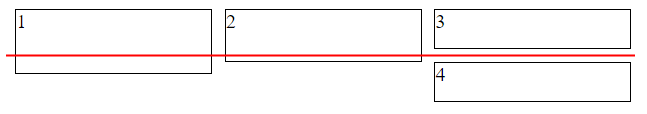
@slowjams第四名在第三名之后,尽管因为没有空位可以放在一行中,所以在第三名(_red_线)之下_slides_。现在,在上一个示例中,没有元素跨越_red_行,因此它始终向左移动,但在示例1和2中,其兄弟中的一个跨越该_red_行并阻止其将所有行往左走。 _red_行由最接近第4个的元素定义,在本例中为第3个。与例如嵌入块相比,它是定义_red_行垂直放置位置的最高元素。 – LGSon
@slowjams我还添加了第四个示例,显示内联块如何在类似的设置中表现 – LGSon
由于您使用的是float: left;,您有义务让p4使用垂直空间来保持优先保持左侧物体的正确位置(实际上最左侧的物体位于该垂直线上)。
使用此代码
ul {

    list-style-type: none;

    padding: 0px;

    margin: 0px;

    width: 100%;

}


ul:after {

    clear: both;

}


ul li {

    width: 33%;

    padding: 0px;

    border: 1px solid #000;

    display: inline-block;

    vertical-align: top;

    margin-right: -4px;

}
<html>
<head>
</head>
<body>
<ul>
<li><p>Content 1</p></li>
<li><p>Content 2</p></li>
<li><p>Content 3</p></li>
<li><p>Content 4</p></li>
</ul>
</body>
</html>PSss !! [链接](https://stackoverflow.com/review/suggested-edits/16497456)请解释您对我所做的更改。这是在审查编辑审计。 – Sanoop
你可以使用下面的代码而不是浮动
div{
    display:flex;
    align-items:flex-start;
    flex-direction:row;
    flex-wrap:wrap
}
发送代码,所以我们将检查错误的位置 –
您可以使用display:inline-block; – athi
“我不明白的是,为什么P4不在P1之下?”。我们也不知道,但是不知道你的代码,或者知道你当时的视口大小,我们不能帮你。这只是一个抽象的截图。这是一个有用的例证,但在确定问题的根本原因方面没有任何意义。 – ADyson